Non-Profit Platform · Web App · Real Client
SAM
Relief Supplies,
Reimagined
Role
UI Design · Video Production · Hi-Fi Design
Client
SAM e.V. — Manuel Hüttel, Bianca Fischer, Hannah Greiner
Tools
Figma · Miro · After Effects
Duration
4 Months
Non-Profit Web Platform Real Client Team Project Video Production ↗ hello-sam.eu
01
Overview
What is
SAM?
SAM is a digital platform that helps non-profit organizations manage, request, and distribute physical resources efficiently. The system enables charities to list items, handle incoming requests, chat with partners, merge multiple articles into packages, and coordinate logistics across locations — all in one place.
4
Months
11
Team Members
Live
hello-sam.eu
My Contribution
"A platform for exchanging and managing relief supplies between aid organizations."
Team
Kawe Ebadi, Lena Bühn, Benedikt Breuer, Lorenzo Bolognini, Alexey Raber, Franziska Fritz, Maria Hoffmann, Franziska Krug, Jakob Neubauer, Alina Stöcker, Nadine Whyler
02
Problem & Goal
The problem
worth solving
The Problem
Surplus sits in warehouses —
while others search in vain
Aid organizations across Germany hold supplies — hospital beds, sleeping bags, food palettes — that other charities urgently need. But without a shared system, these resources stay invisible. Requests are sent by email, coordination happens over phone, and nothing is tracked.
No shared platform to list or discover available supplies
Requests scattered across email and phone — nothing centralized
No way to bundle items or coordinate logistics across locations
The Goal
One platform —
from request to delivery
Design and deliver a live web platform where charities can list supplies, send and manage requests, communicate directly with partners via chat, bundle multiple items into packages, and coordinate the full logistics chain — from first contact to confirmed handover.
Marketplace for listing and discovering relief supplies
Integrated chat with request status tracking
Package bundling and multi-location logistics overview
Design Challenge
How might we help aid organizations find, request, and coordinate relief supplies — replacing scattered emails with a single, trusted platform?
03
Research & Insights
Understanding
the problem space
Step 01 — User Flows & Architecture Three models, one structure
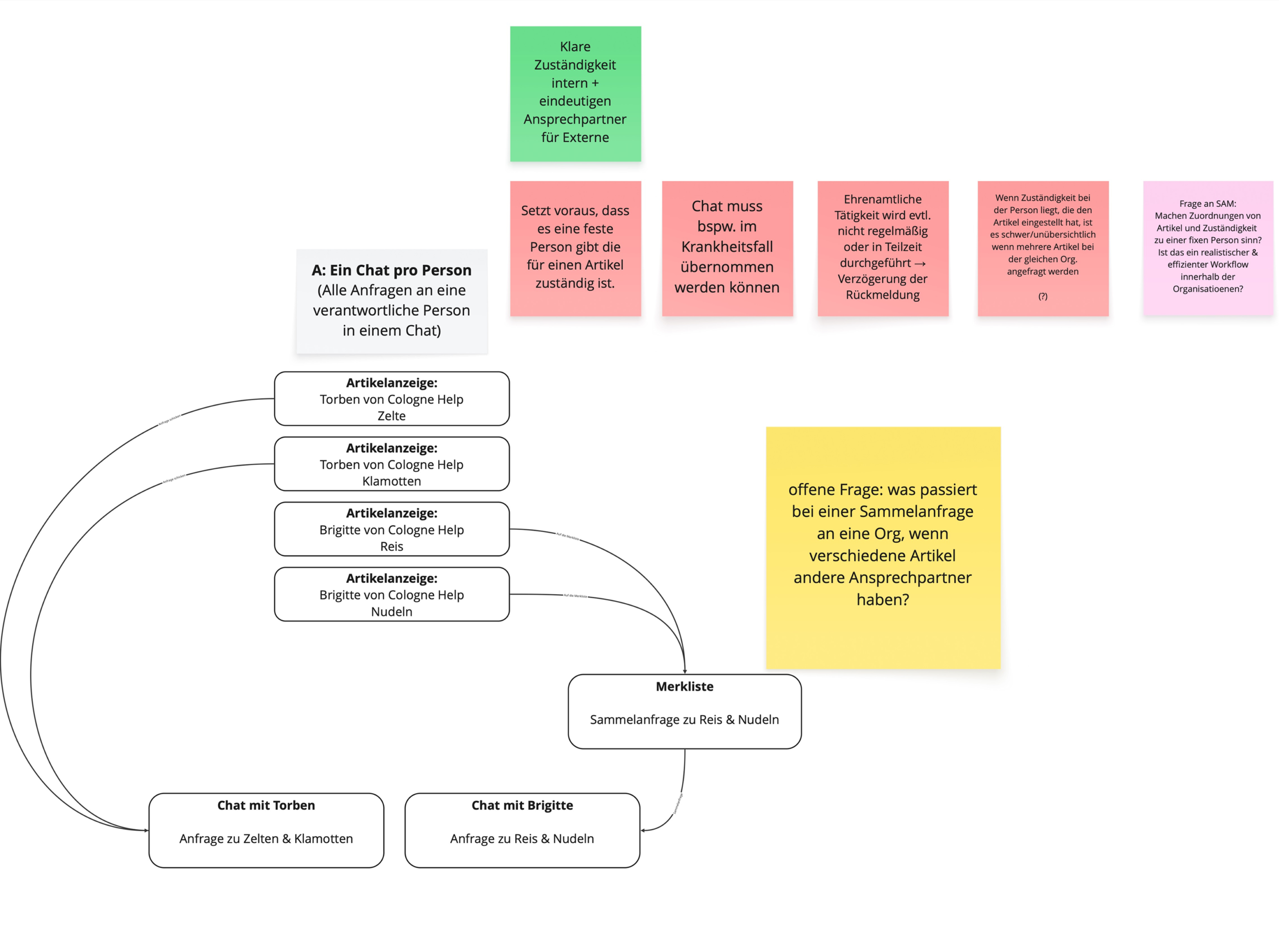
We explored three communication models to understand how organizations manage item requests — comparing clarity, scalability, and coordination. The findings directly shaped SAM's information architecture: predictable navigation, clear context at every step, and logical grouping of requests, chats, and listings.
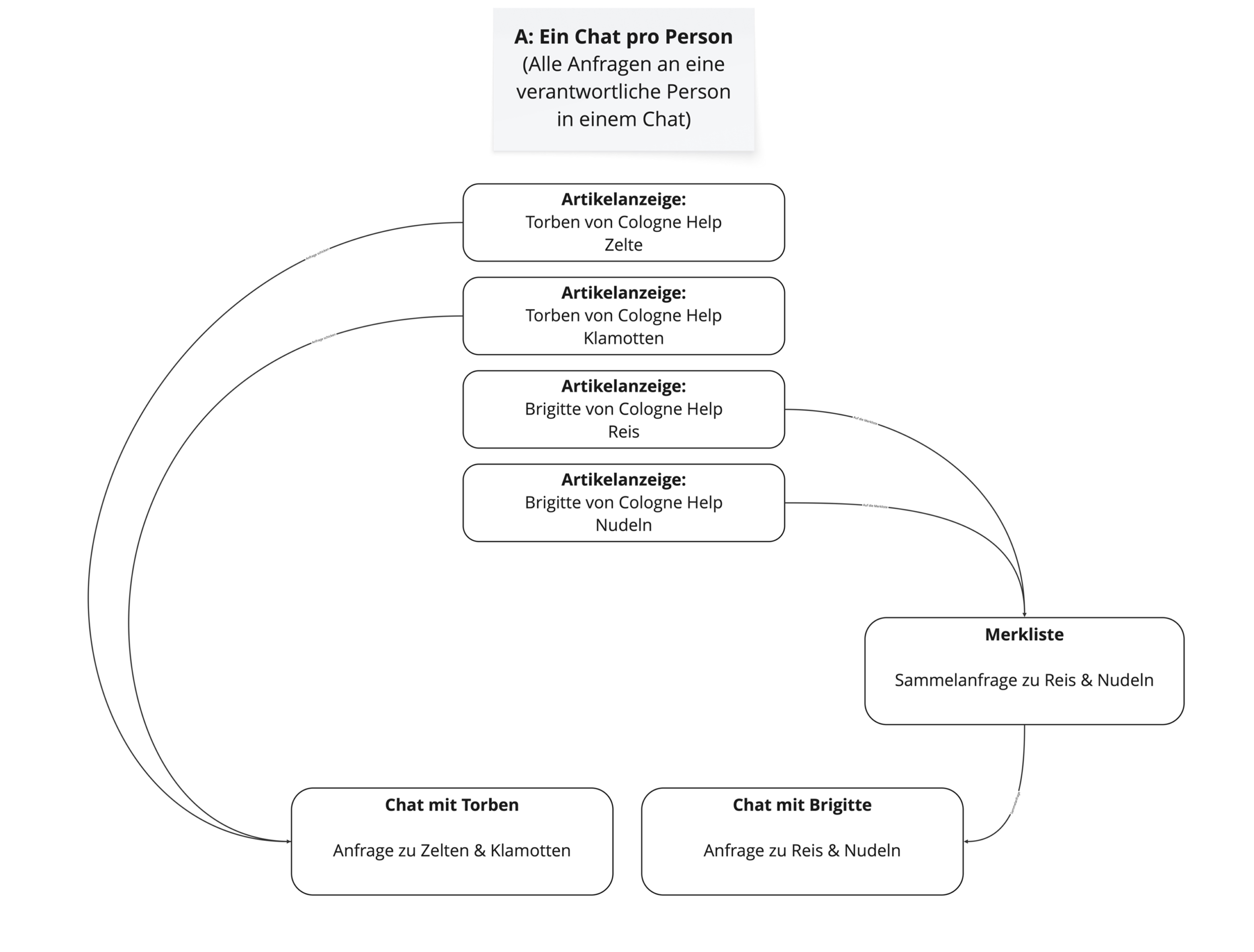
User Flow Model A clean
Model A — one chat per person
User Flow Model A analysis
Model A — pros, cons & open questions
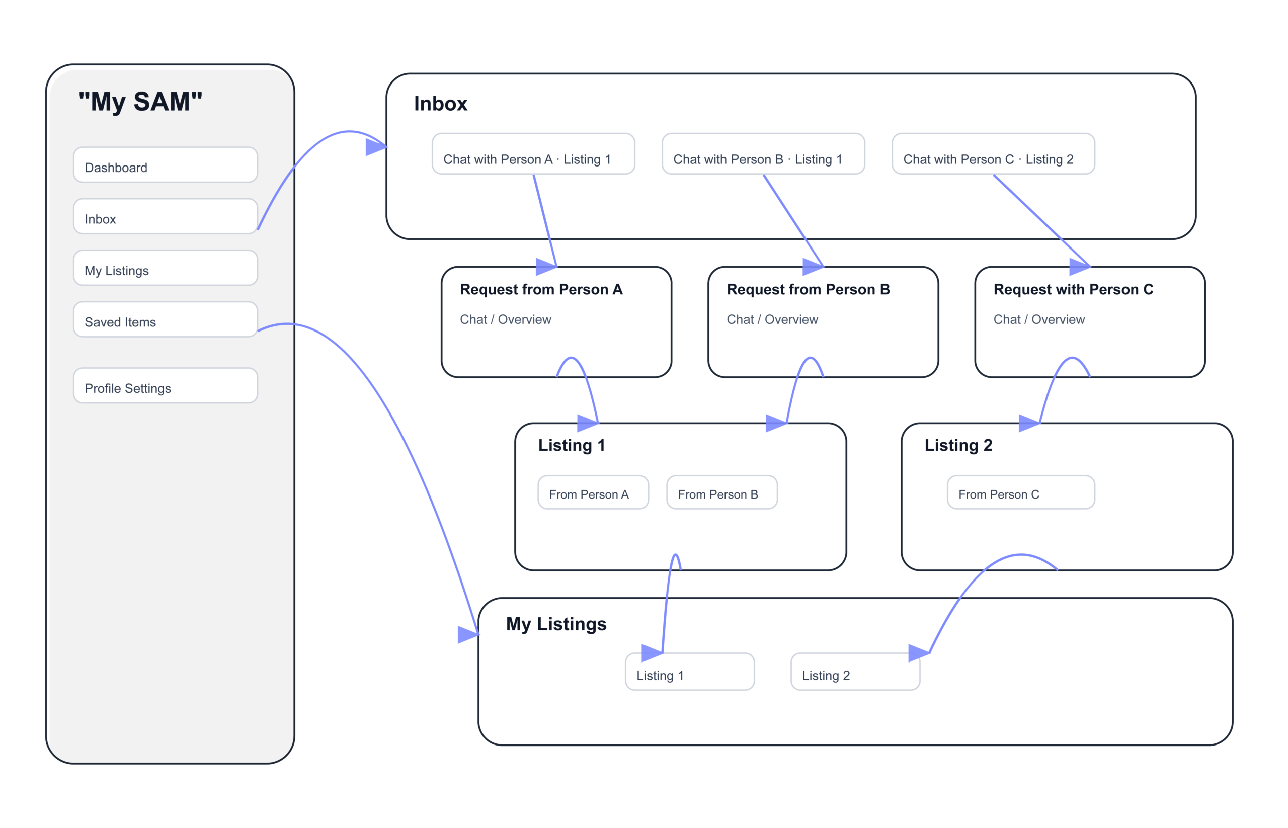
Information Architecture
Final information architecture — navigation & flow structure
Step 02 — Key Insights What the research revealed
01
Context is everything
Users need to know which item a chat refers to at all times — losing context breaks trust and coordination between organizations.
02
Bundling saves time
The package feature was the most impactful decision — merging multiple items into one request saves significant coordination effort for both sides.
03
Status clarity reduces errors
Clear request states — angefragt, reserviert, bestätigt — prevent double bookings and give both parties confidence at every step.
04
Design Decisions
From problem
to solution
Step 01 — Wireframes
Structure before
visual design
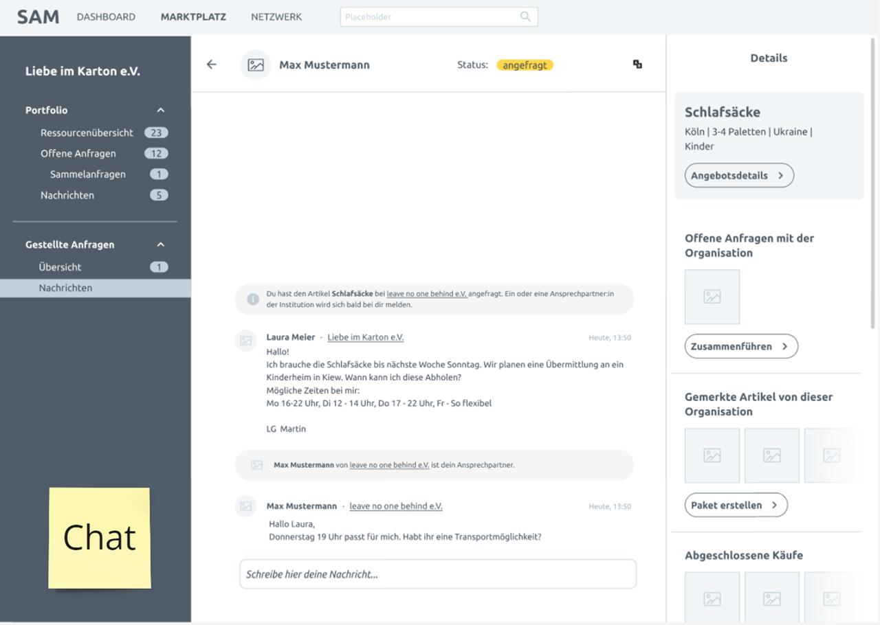
Mid-fidelity wireframes validated the two core screens — saved items and the chat interface — before any color or styling was applied. Every element was tested for clarity and reachability.
Saved items list scannable at a glance
Chat always tied to a specific item for context
Request actions kept within thumb reach
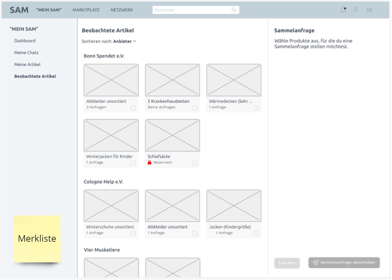
Wireframe Beobachtete Artikel Wireframe Chat Screen
Step 02 — Challenges & Solutions
Where the design
got hard
The biggest challenge was UI complexity — too many features cluttered the interface early on. The solution was progressive disclosure: only show what the user needs at each step, with details revealed on demand.
Reduced visible actions per screen to avoid overload
Chat context — item name and status — always visible above messages
Status changes require one deliberate tap to prevent mistakes
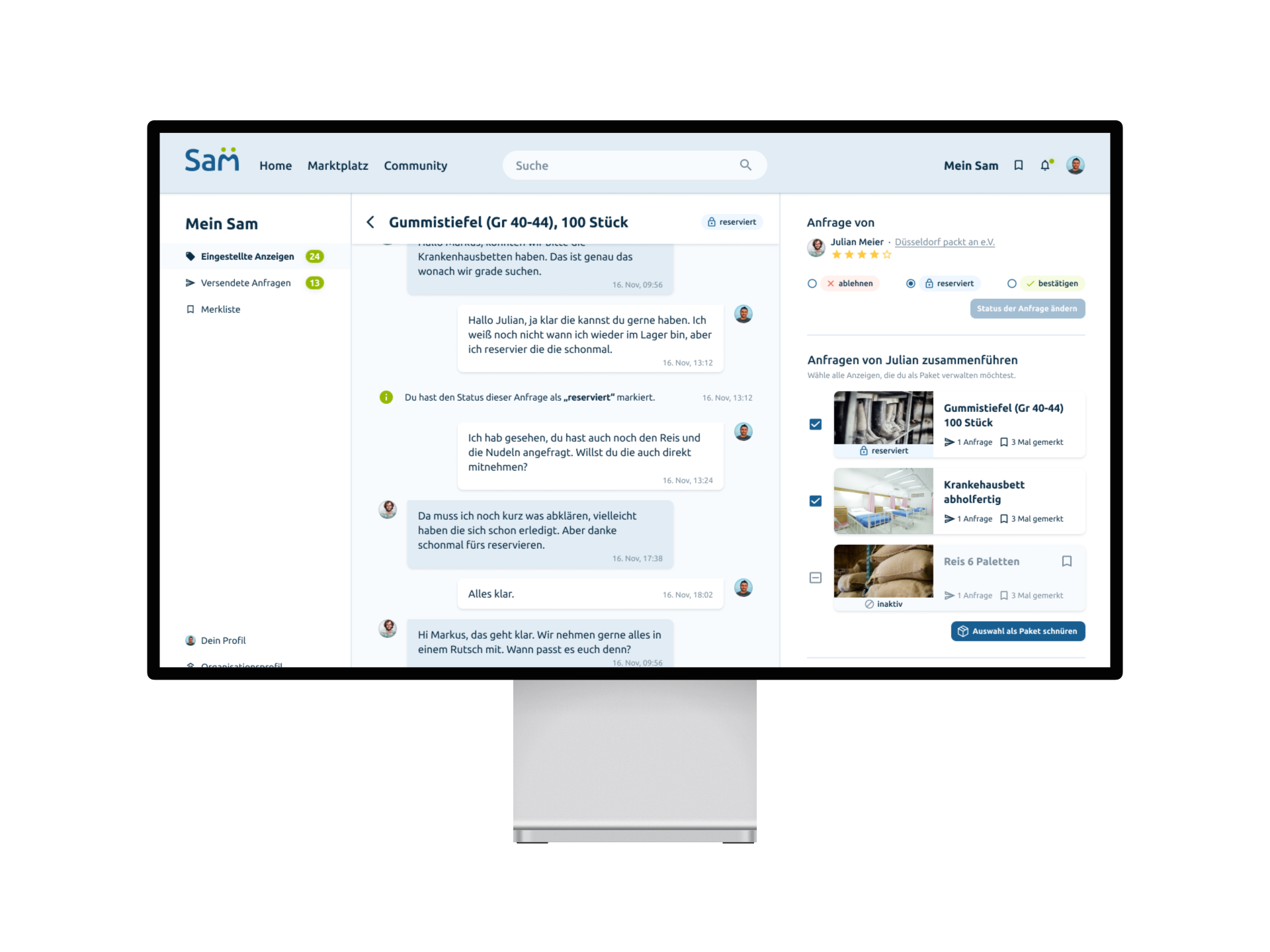
Challenges and annotated Chat screen
Step 03 — Design System
One system,
every screen
A consistent component library — typography, buttons, status badges, and card layouts — kept all 16+ screens visually coherent and made handoff to the development team fast and precise.
Defined type scale and spacing tokens used across all screens
Reusable card and list components built once, applied everywhere
Status badge system for all request states — angefragt, reserviert, bestätigt
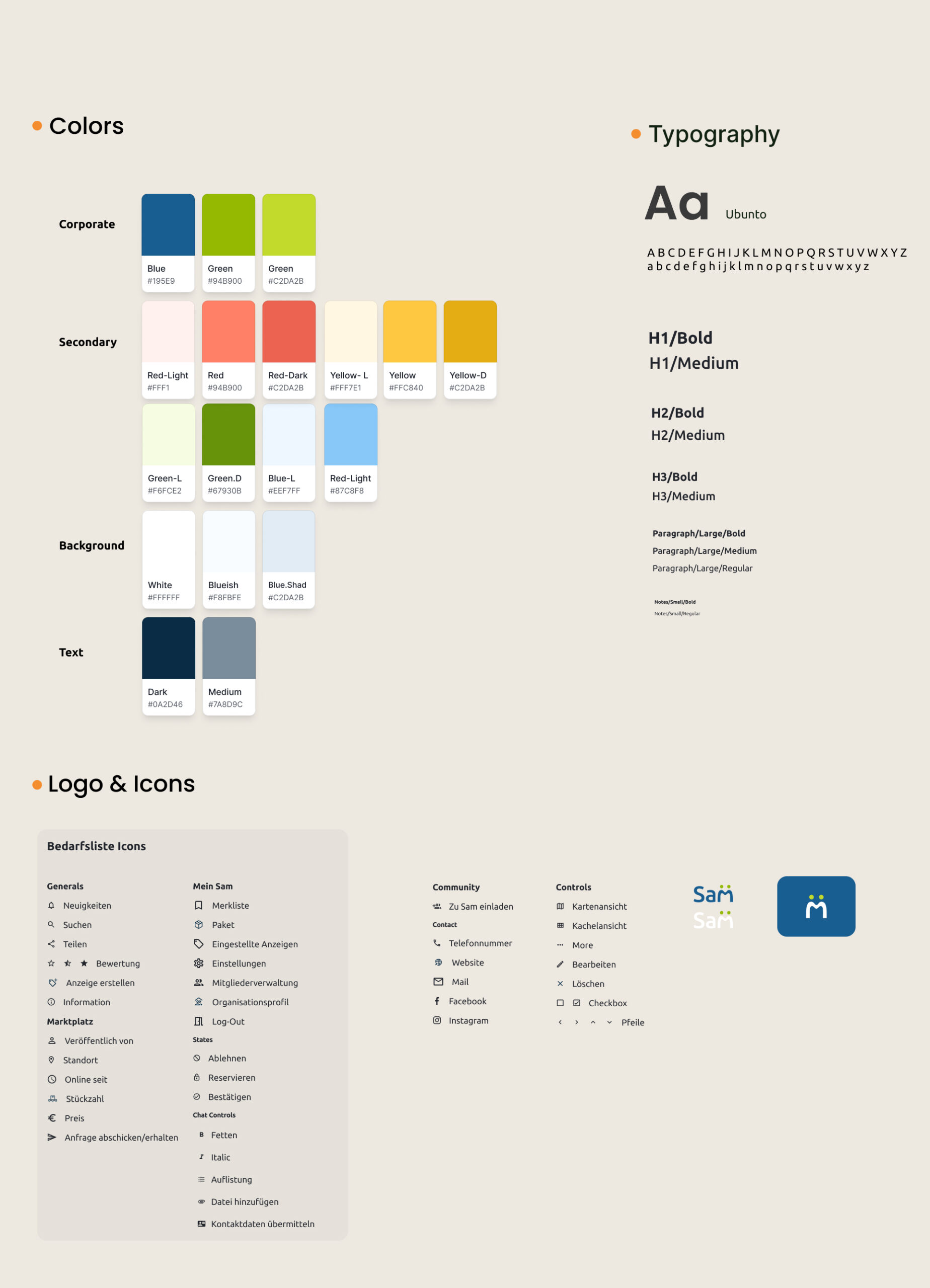
Design System and Typography
05
Design Showcase
The final
design
Screen 01 — Dashboard
The complete
overview
The SAM dashboard gives organizations an instant overview of their resources, open requests, and saved items — all accessible in one tap from the main navigation.
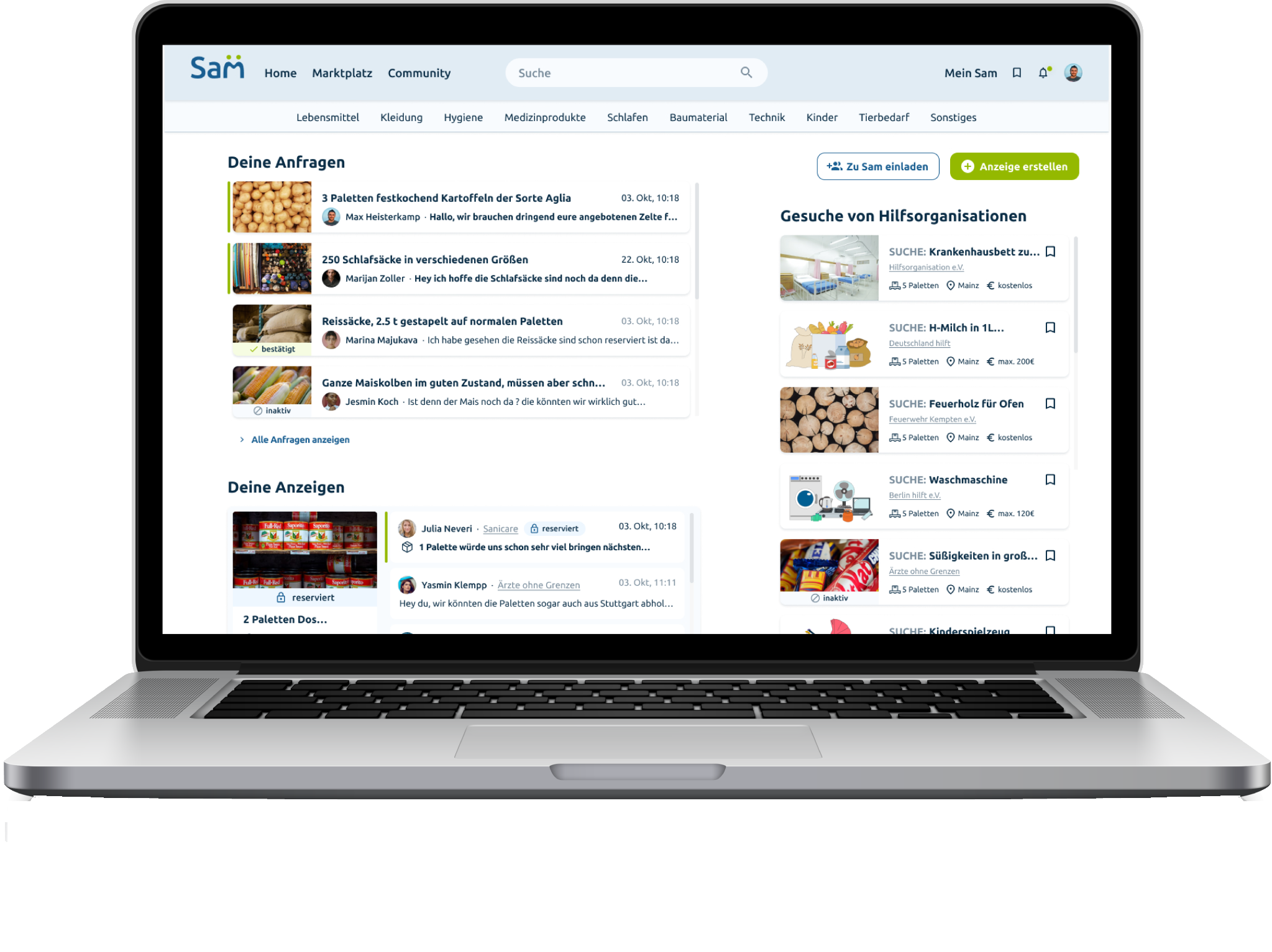
SAM Dashboard Laptop Mockup
Screen 02 — Listings & Community
Manage, connect,
coordinate
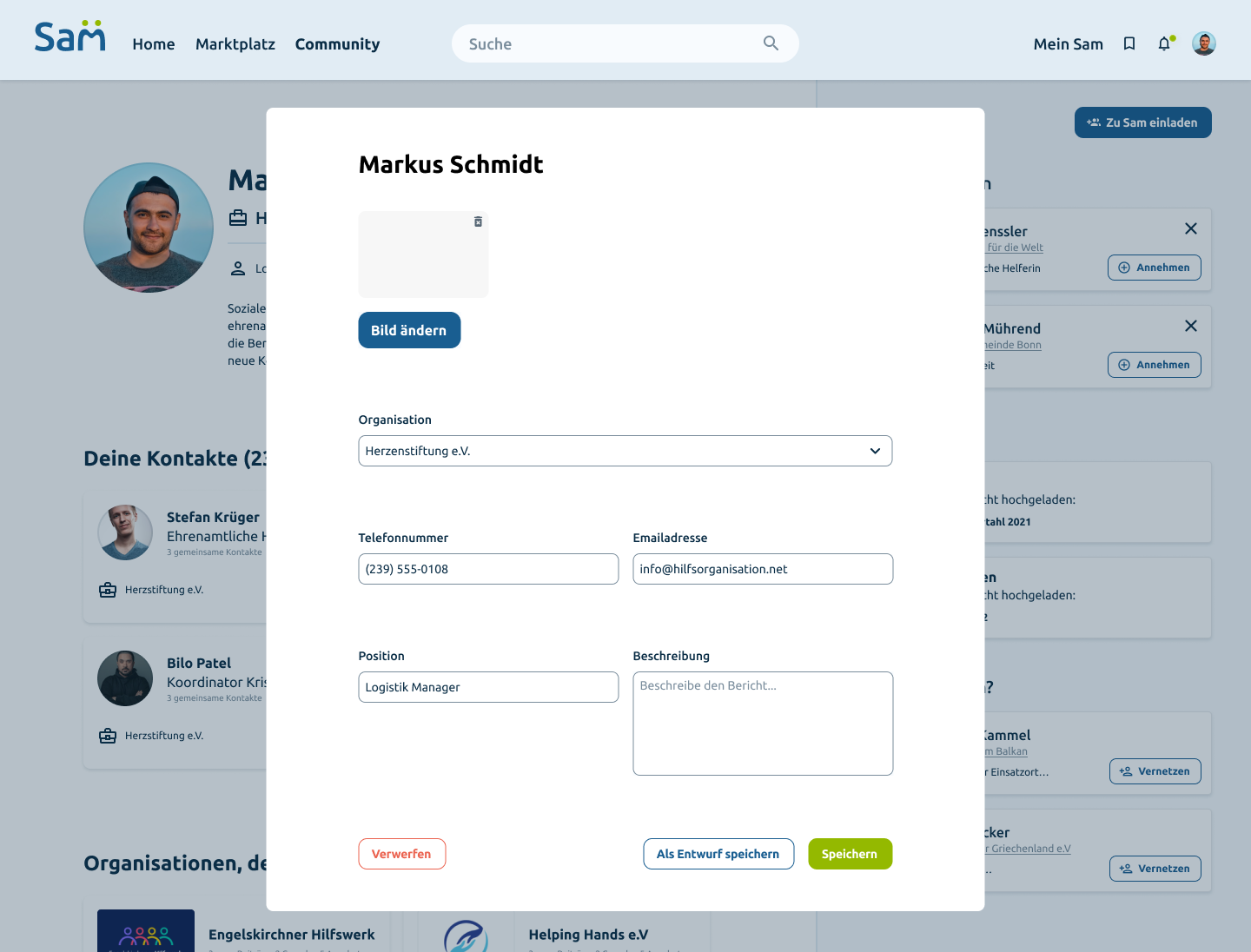
The listings screen gives a full overview of all created offers — grouped by packages and individual requests, filterable by status and date. The profile editing screen allows users to update their contact details, organization, and role directly within the platform — keeping the network accurate and up to date.
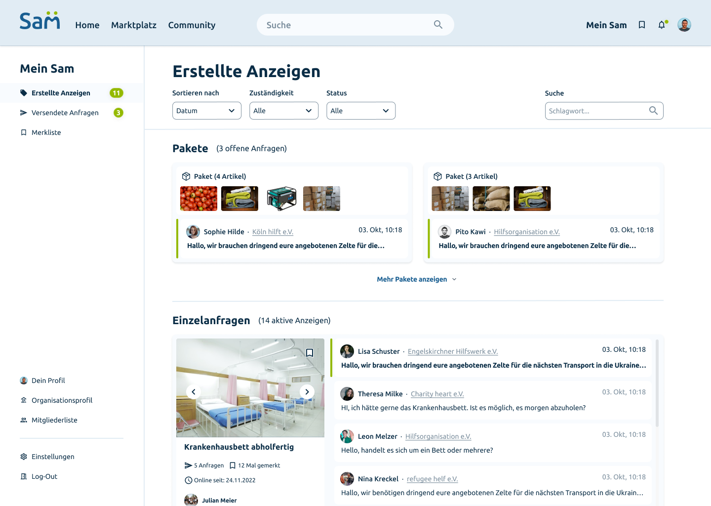
Erstellte Anzeigen — Pakete und Einzelanfragen Profil und Community Ansicht
Screen 03 — Video Production
Beyond design —
motion & story
As part of the project scope, a promotional video was produced to present SAM to potential partner organizations and demonstrate the platform's core value in under 90 seconds.
06
Outcome & Impact
What the design
achieved
Live
hello-sam.eu
Platform successfully launched and accessible to aid organizations across Germany
Real client project
11
Team Members
Cross-functional team — UI, development, video production — coordinated over 4 months
Project scope
3
Core Deliverables
Hi-fi UI design, information architecture, and a promotional video — all shipped
Beyond initial brief
SAM successfully replaced scattered email and phone coordination with a single, trusted platform. Aid organizations can now list supplies, manage requests, bundle items into packages, and coordinate logistics — all in one place. The live product at hello-sam.eu is actively used by non-profits across Germany.
07
Key Learning
What I learned
along the way
01
Scope kills clarity
Too many features planned upfront made the UI complicated and confusing. Starting with the essential core and adding features gradually would have kept the design sharper from day one.
02
Real clients need real structure
Working with an actual client meant aligning on priorities, managing feedback, and making decisions under pressure. Structure and clear communication mattered as much as the design itself.
03
Context prevents confusion
Every chat, request, and action needs to make sense without explanation. When context was missing in early wireframes, users lost orientation. Making context visible at all times was the fix.
04
Ship beyond the brief
Producing the promotional video wasn't required — but it elevated the entire project. Going beyond what's asked, when done well, is what makes work memorable.
If I continued
The next step would be live usability testing with real organizations, refining the package flow, and adding a mobile-optimized version for field workers.
fin.
End of Case Study — SAM
Thanks
for reading
Want to see more work, talk about a project, or just say hello? I'd love to hear from you.