04
Design Decisions
From sketch
to solution
to solution
Step 01 — Wireframes
Structure before
visual design
visual design
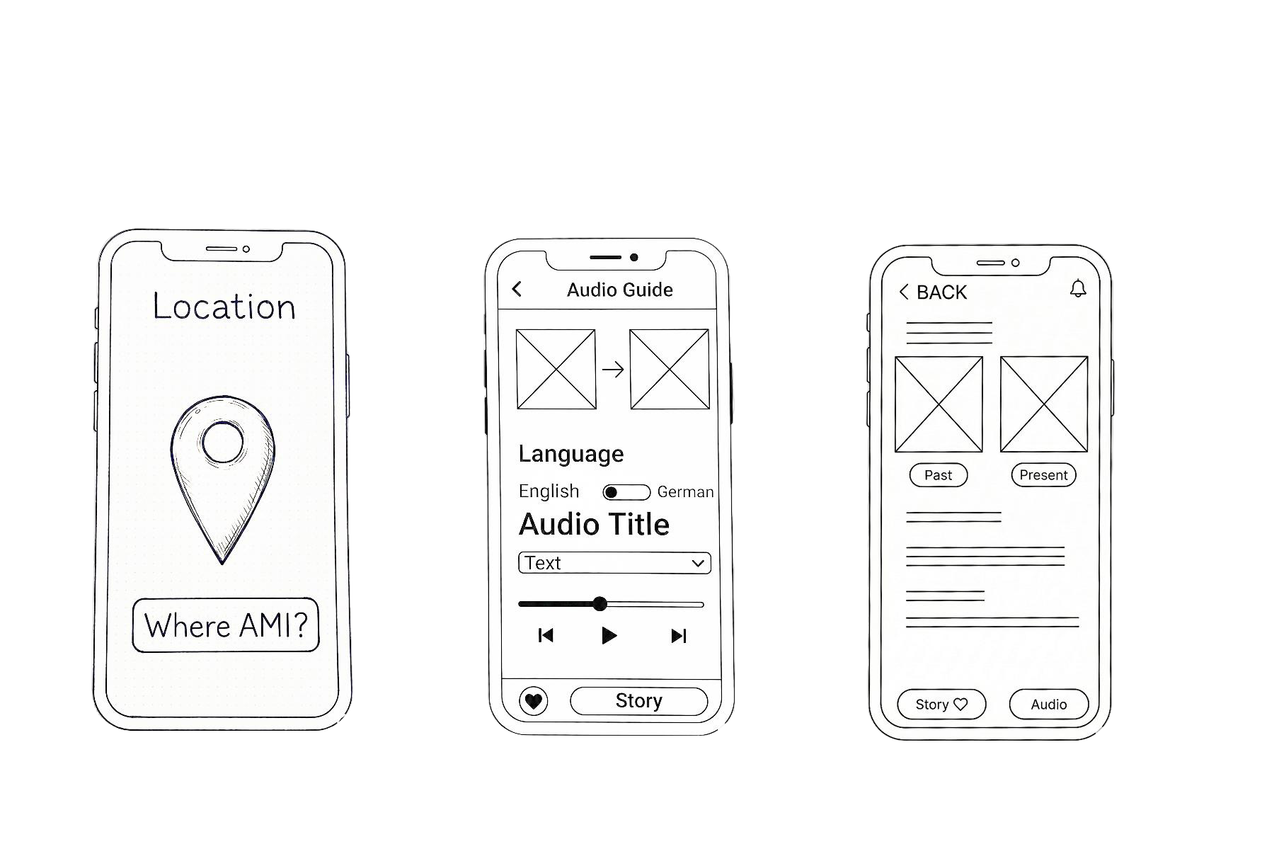
Before any visual decisions, I mapped out the core flows — location awareness, audio playback, and the past/present toggle. Low-fidelity wireframes helped validate the navigation structure early.
Intuitive navigation hierarchy
Simple AR entry point
Minimal cognitive load outdoors
Step 02 — AR Interaction
Camera first,
content second
content second
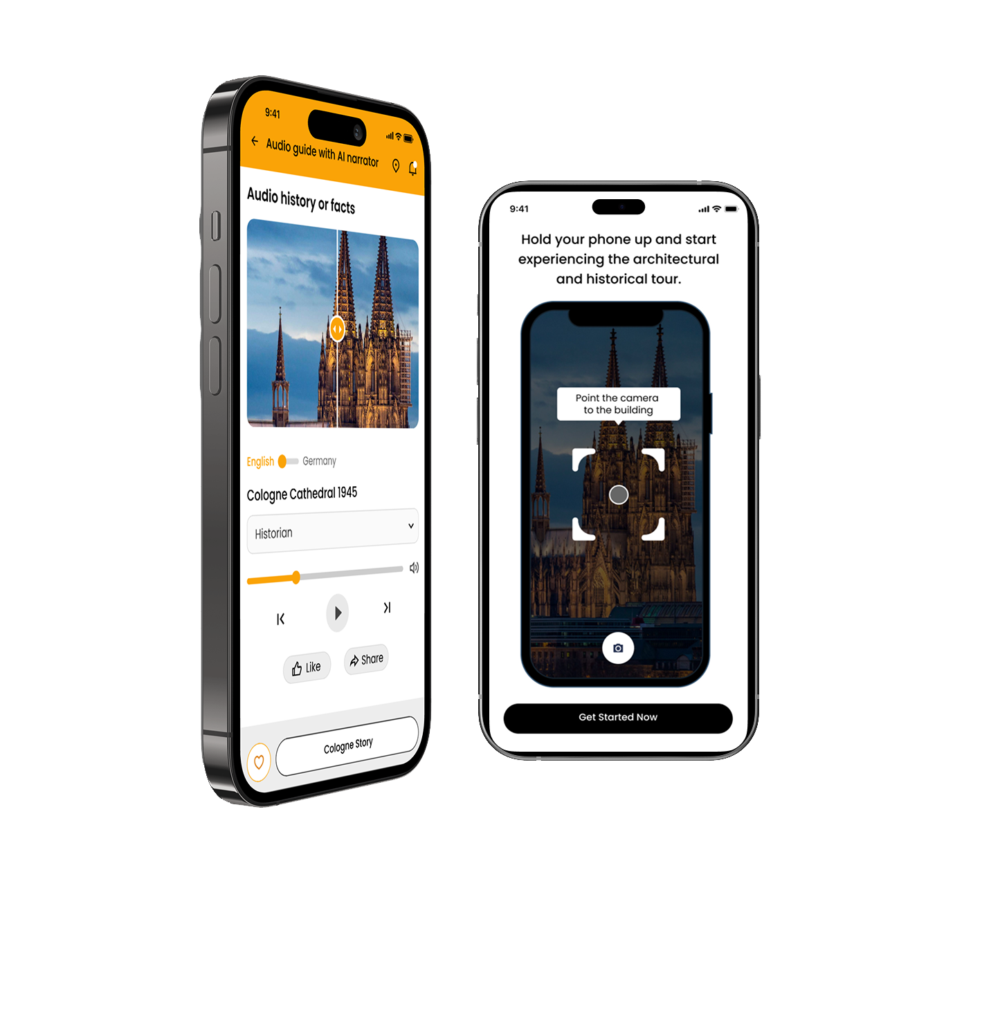
The AR experience starts immediately — no menus, no onboarding walls. A scan frame guides users to point at a building and the story appears within seconds.
Large central capture button for one-hand use
Short imperative copy reduces confusion outdoors
Fullscreen view keeps focus on architecture
Step 03 — Information Architecture
Two paths,
one clear entry
one clear entry
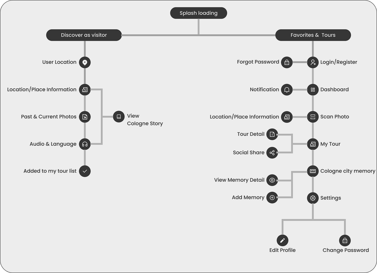
The app splits into two distinct flows — casual discovery without registration, and a personalised experience for saved tours and memories. This decision removed the biggest friction point users face.
No forced sign-up to explore
Clear separation of guest vs. user features
Logical grouping reduces navigation depth
05
Design Showcase
The final
design
design
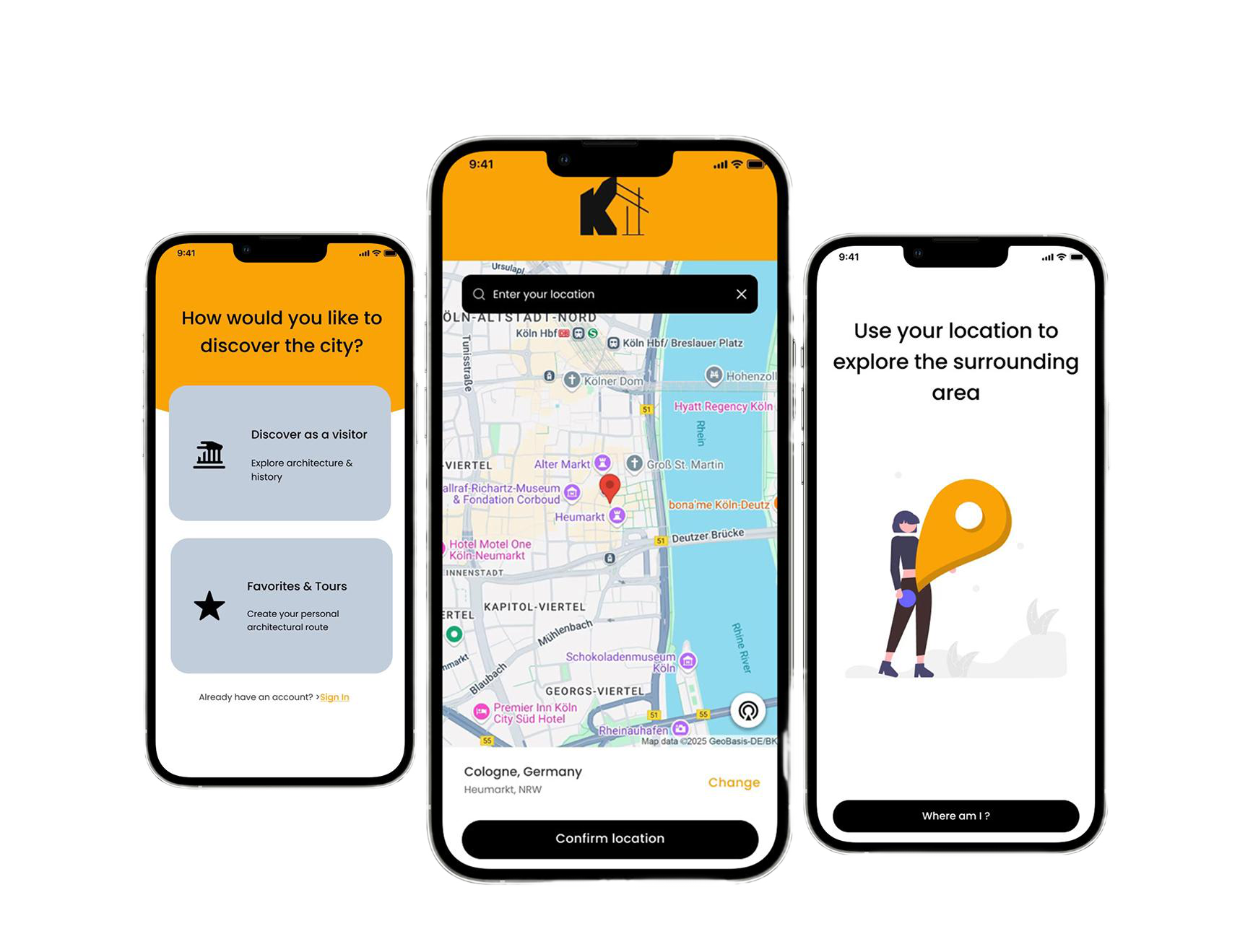
Screen 01 — Onboarding
Choose your path, instantly
No forced sign-up. Users choose how they want to discover the city — as a visitor or with a personal tour account. The map confirms their location before anything else loads.
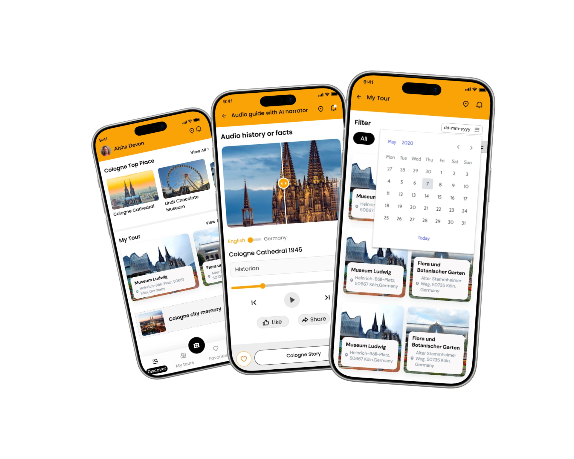
Screen 02 — Core Features
Home, audio & my tour
The three screens users spend the most time in — discovering places, listening to historical audio guides, and planning their personal tour with a smart calendar filter.
Screen 03 — UI Details
Every element has a reason
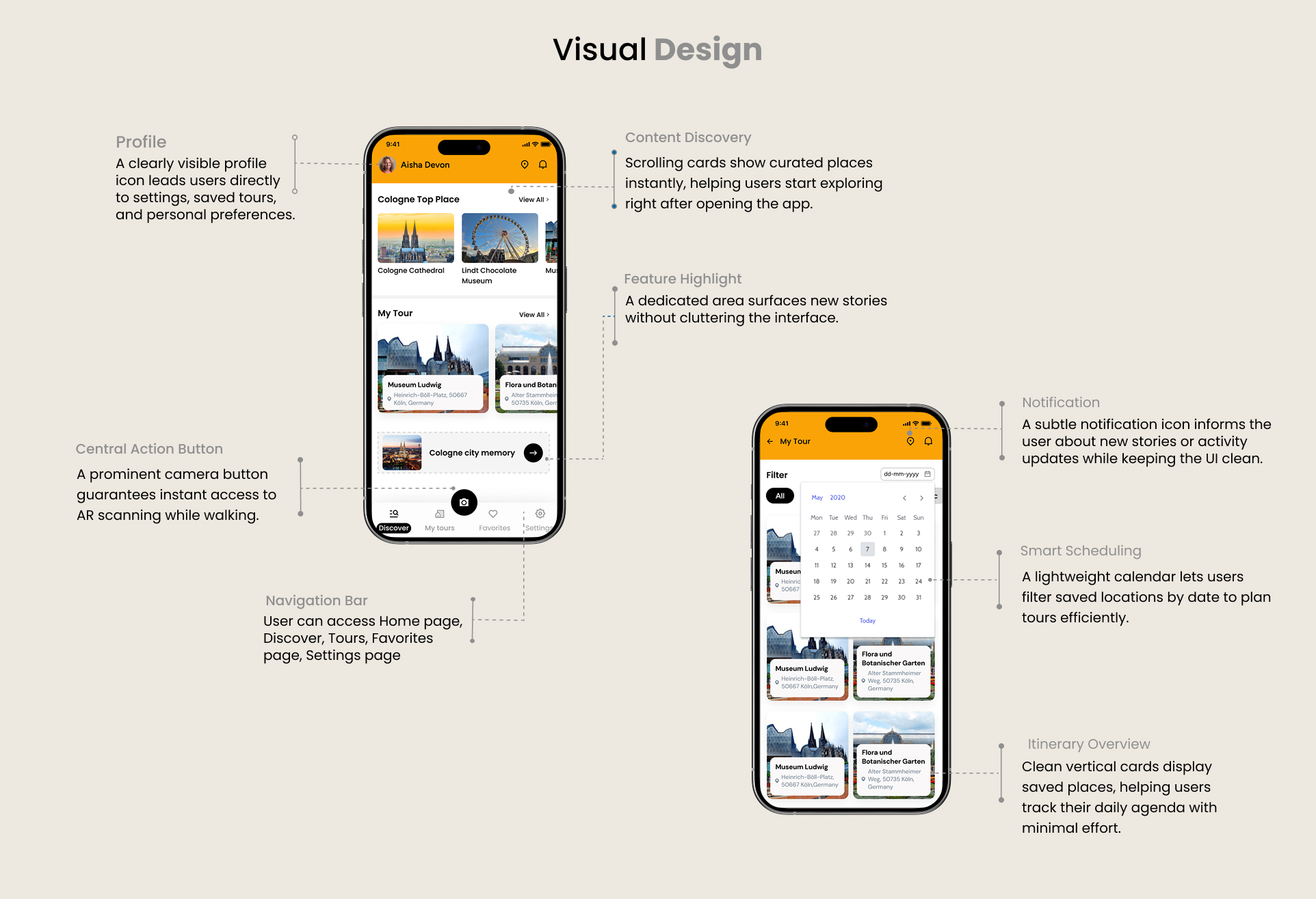
Annotated screens showing the key UI decisions — from the central camera button for instant AR access, to the clean navigation bar and smart scheduling view.