Fintech · Mobile App
PlutoPay
Financial Clarity
& Control
Role
UX/UI Designer
Platform
Crafted for Mobile
Tools
Figma · Notion · Google Docs
Fintech Mobile Design User Research Subscription Management Prototyping
01
Overview
What is
PlutoPay?
PlutoPay is a mobile finance app that helps users manage subscriptions and expenses transparently. It detects recurring payments automatically, sends real-time alerts, and gives users one-click control over their financial life — fewer surprises, more clarity.
4
Weeks
Solo
Designer
Fintech
Mobile First
My Contribution
"I'm paying for subscriptions I don't even use anymore."
As sole designer I led the full UX process — from user research and personas, through wireframing and testing, to a complete high-fidelity design system ready for handoff.
02
Problem & Goal
The problem
worth solving
The Problem
Hidden costs,
zero control
People lose track of recurring payments and feel blindsided by unexpected charges. Existing banking apps show transactions — but don't help users understand or act on them.
Forgotten subscriptions drain accounts silently
No clear overview of what's recurring vs one-time
Managing finances feels overwhelming, not empowering
The Goal
Clarity before
the charge hits
Design a finance app that detects recurring payments automatically, alerts users in advance, and gives them one-click control — turning anxiety into confidence.
Automatic detection of subscriptions & recurring bills
Real-time alerts before charges occur
One-click cancel, pause, or manage
Design Challenge
How might we help users understand and control their recurring finances — before it's too late?
03
Research & Insights
Understanding
the user
Step 01 — Persona Who we designed for
Meet Emil — a 24-year-old student from Cologne, single, and always on his phone. He wants to see all his subscriptions and expenses at a glance — without having to search for them. His biggest frustration: forgotten subscriptions and banking apps that feel overloaded and complicated.
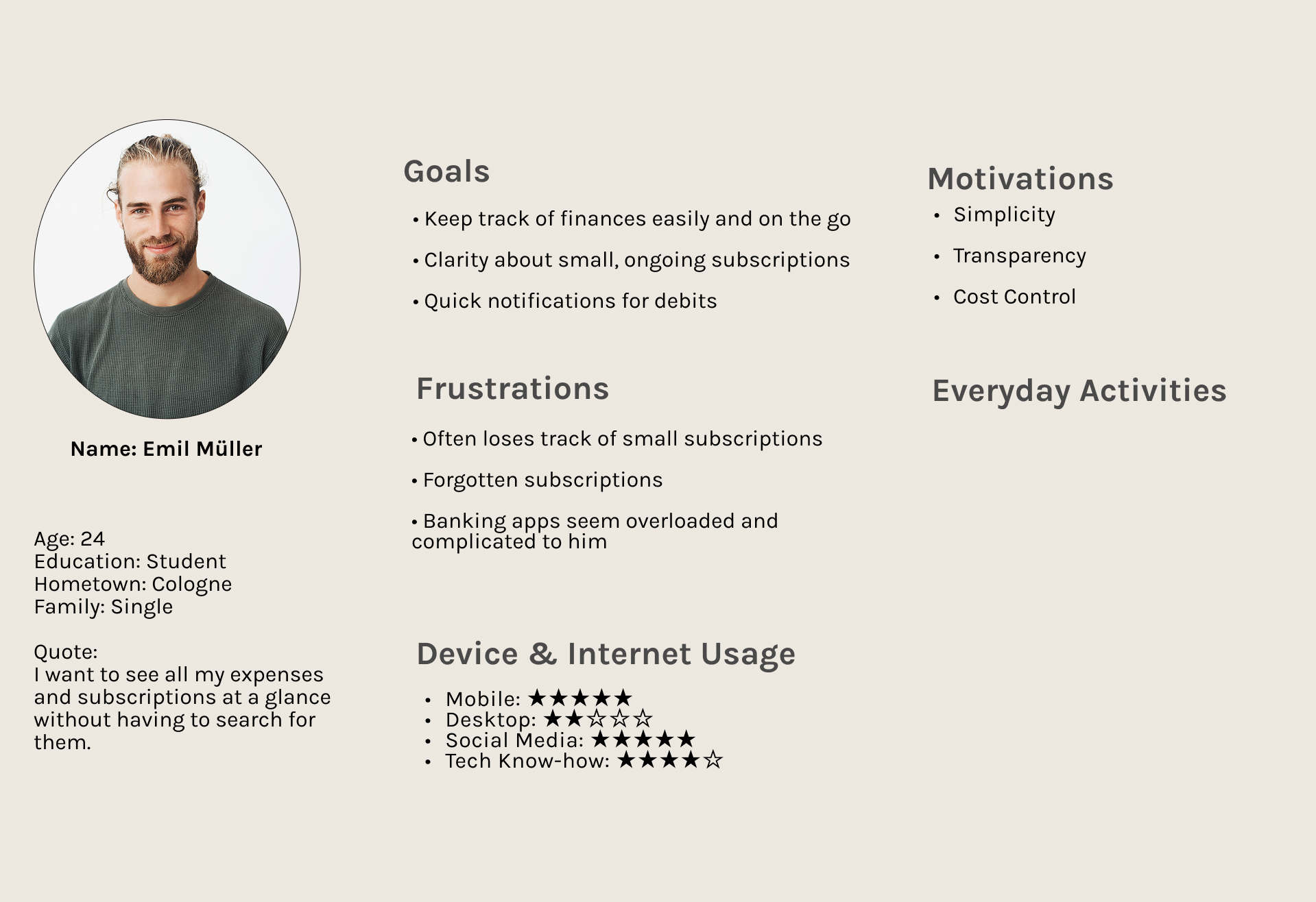
User Persona Emil Müller
Step 02 — Empathy Map What Emil thinks, feels & does
Mapping what Emil says, thinks, feels, and does revealed a clear tension — he wants simplicity and transparency, but existing apps overwhelm him. He avoids checking his finances not because he doesn't care, but because it feels too complicated.
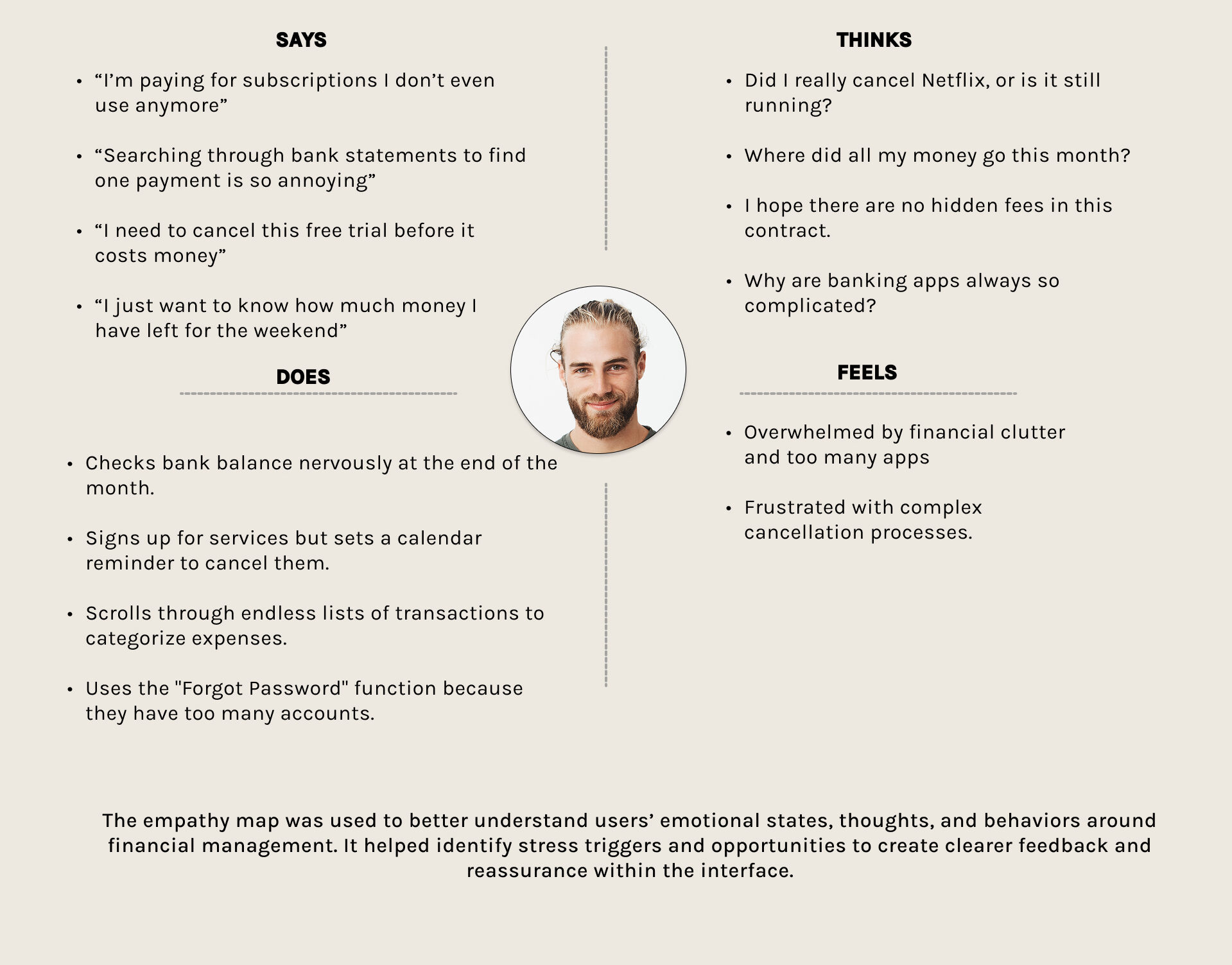
Empathy Map
Step 03 — Key Insights What the research revealed
01
Simplicity over features
Emil wants clarity at a glance — not more features. Less is more when managing money on the go.
02
Forgotten = lost money
Small recurring charges go unnoticed for months. Awareness before the charge is the key to control.
03
Mobile is everything
Emil is a 5-star mobile user — the app must work perfectly on phone, fast and without friction.
04
Design Decisions
From sketch
to solution
Step 01 — User Flows
Mapping every
possible path
Before touching the UI, I mapped out three core flows — onboarding, subscription management, and payment alerts. This ensured no user action was left without a clear next step.
Onboarding without forced registration
Clear entry points for each core feature
Minimal steps from alert to action
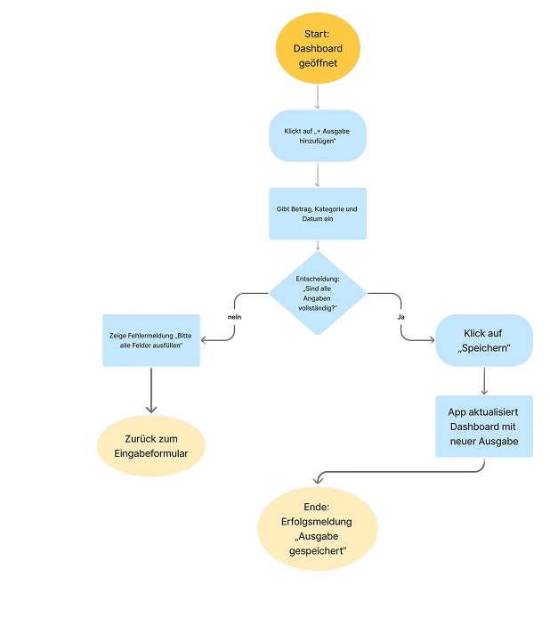
User Flow
Step 02 — Wireframes
Structure before
visual design
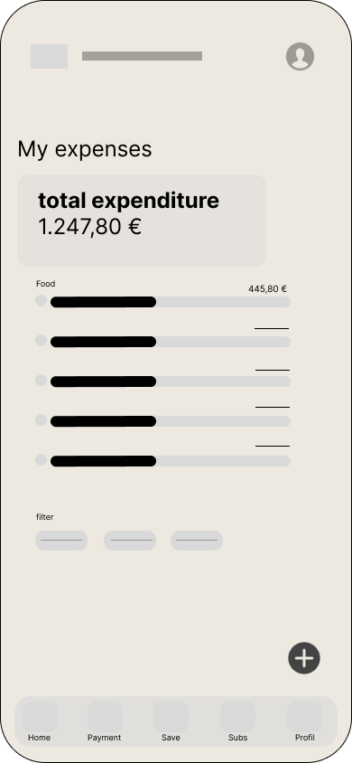
Mid-fidelity wireframes validated the two most important screens — the subscription overview and the expenses dashboard. Balance and clarity were confirmed before any styling was applied.
Subscriptions listed with clear show/hide detail
Total expenditure always visible at top
Filter system keeps the view focused
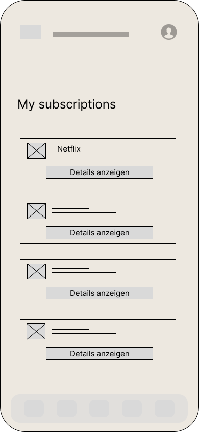
Subscriptions Wireframe Expenses Wireframe
Step 03 — Information Architecture
One app,
clear structure
The sitemap defined how every screen connects — from home to settings, from alerts to payment history. A flat structure keeps navigation shallow and intuitive for Emil.
Max two taps to reach any feature
Logical grouping of subscriptions & payments
Settings kept separate from core flow
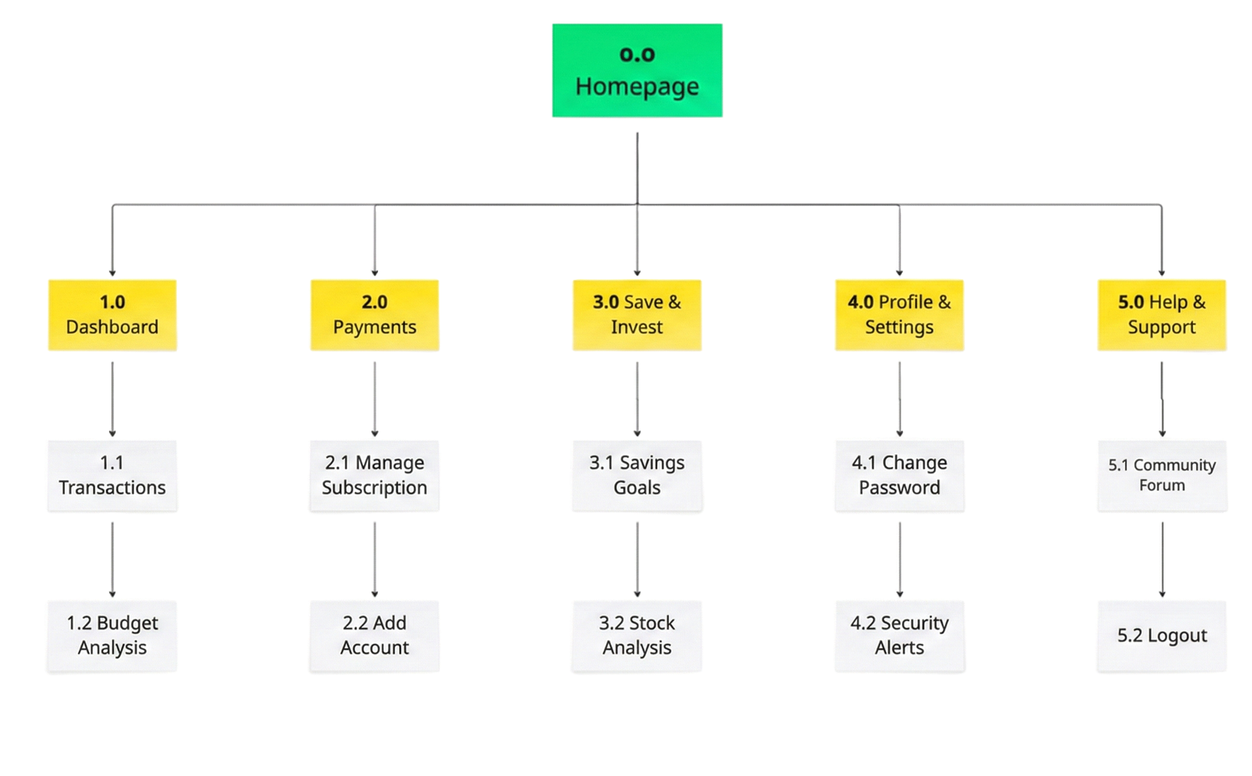
Sitemap
05
Design Showcase
The final
design
Screen 01 — All Screens The complete product
A full overview of PlutoPay — from onboarding and sign up, through the payments dashboard and expense tracking, to savings goals and subscription management. Every screen follows a consistent visual language: teal for trust, blue for action, white for clarity.
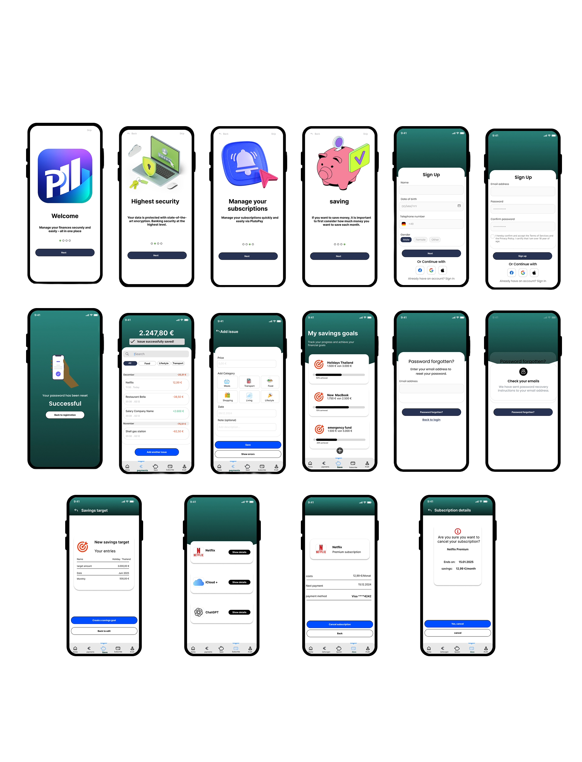
High-Fidelity Prototype all screens
Screen 02 — Core Experience Payments & expense entry
The payments dashboard provides an instant overview of the current balance and full transaction history — grouped by month and filterable by category. The expense entry screen allows users to log a new payment in seconds, simply by selecting a category icon and hitting save.
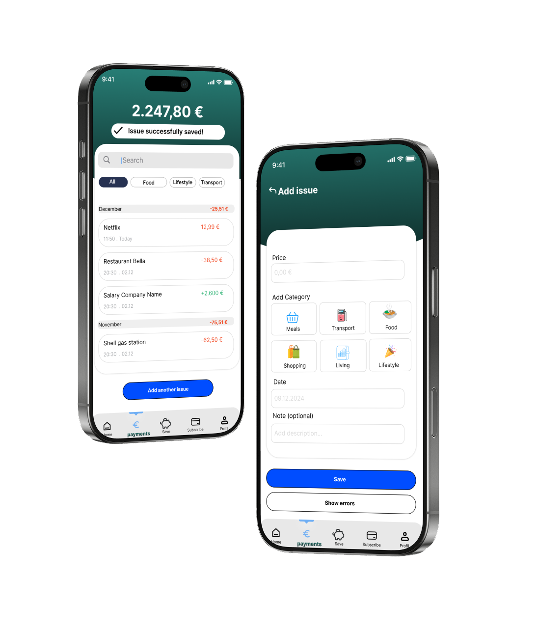
Payments and Add Issue screens
Screen 03 — Visual Design Every element has a reason
Annotated screens showing the key UI decisions — the prominent Save button within thumb reach, instant system feedback after every action, financial overview always visible at the top, and bottom navigation giving Emil access to all five core areas in one tap.
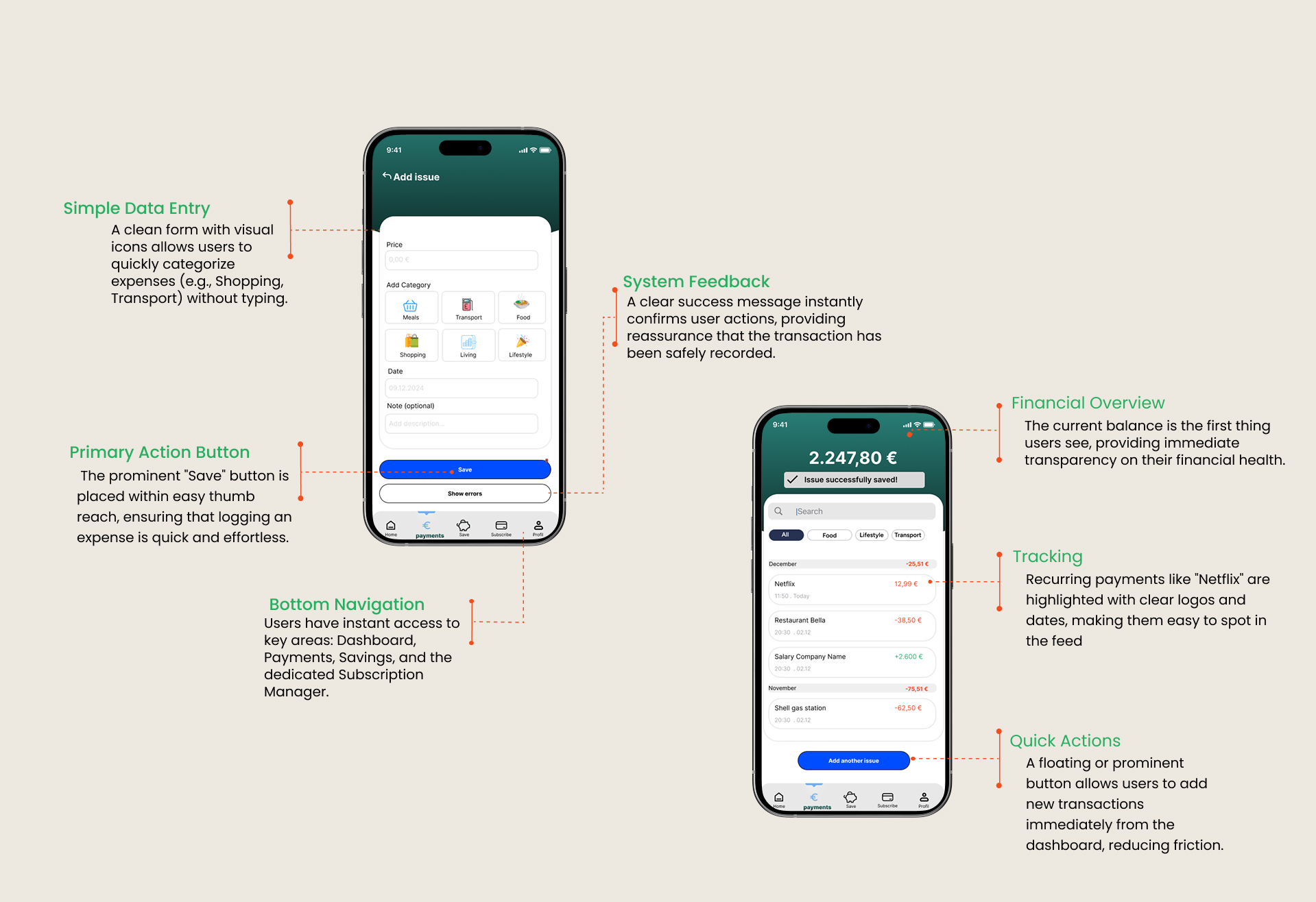
Visual Design annotated screens
06
Outcome & Impact
What the design
achieved
4.6/5
Usability Score
Average rating on clarity and ease of use across test sessions
Based on concept feedback
88%
Task Completion
Users completed the subscription cancel flow without any guidance
Simulated prototype testing
5
Core Screens
Home, Payments, Save, Subscribe, Profile — all reachable in one tap
Core design decision
PlutoPay successfully addressed Emil's three core frustrations — forgotten subscriptions, overwhelming banking apps, and no clarity on recurring costs. The design keeps the balance visible at all times, makes expense logging take under 10 seconds, and puts subscription control one tap away.
07
Key Learning
What I learned
along the way
01
Finance needs trust first
Users won't engage with a finance app they don't trust. Every micro-interaction — the success message, the clear balance display — had to feel safe and reliable before anything else.
02
Less friction, more action
The faster Emil can log an expense, the more likely he is to do it. Every extra tap was a reason to give up. Reducing the entry flow to icon-tap + save was the most impactful decision.
03
Structure before style
Spending time on wireframes and the sitemap before any visual design saved significant rework. The navigation hierarchy only made sense after testing the mid-fi prototype.
04
Design systems pay off
Building a consistent component library early — buttons, cards, navigation states — made scaling to 16 screens fast and kept the visual language coherent throughout.
If I continued
The next step would be live usability testing with real bank data integration, adding smart budget alerts, and exploring a shared expenses feature for flatmates and couples.
fin.
End of Case Study — PlutoPay
Thanks
for reading
Want to see more work, talk about a project, or just say hello? I'd love to hear from you.