Architecture Discovery
A mobile AR concept that lets people explore architecture through their phone — discovering buildings, layers and stories in physical space.
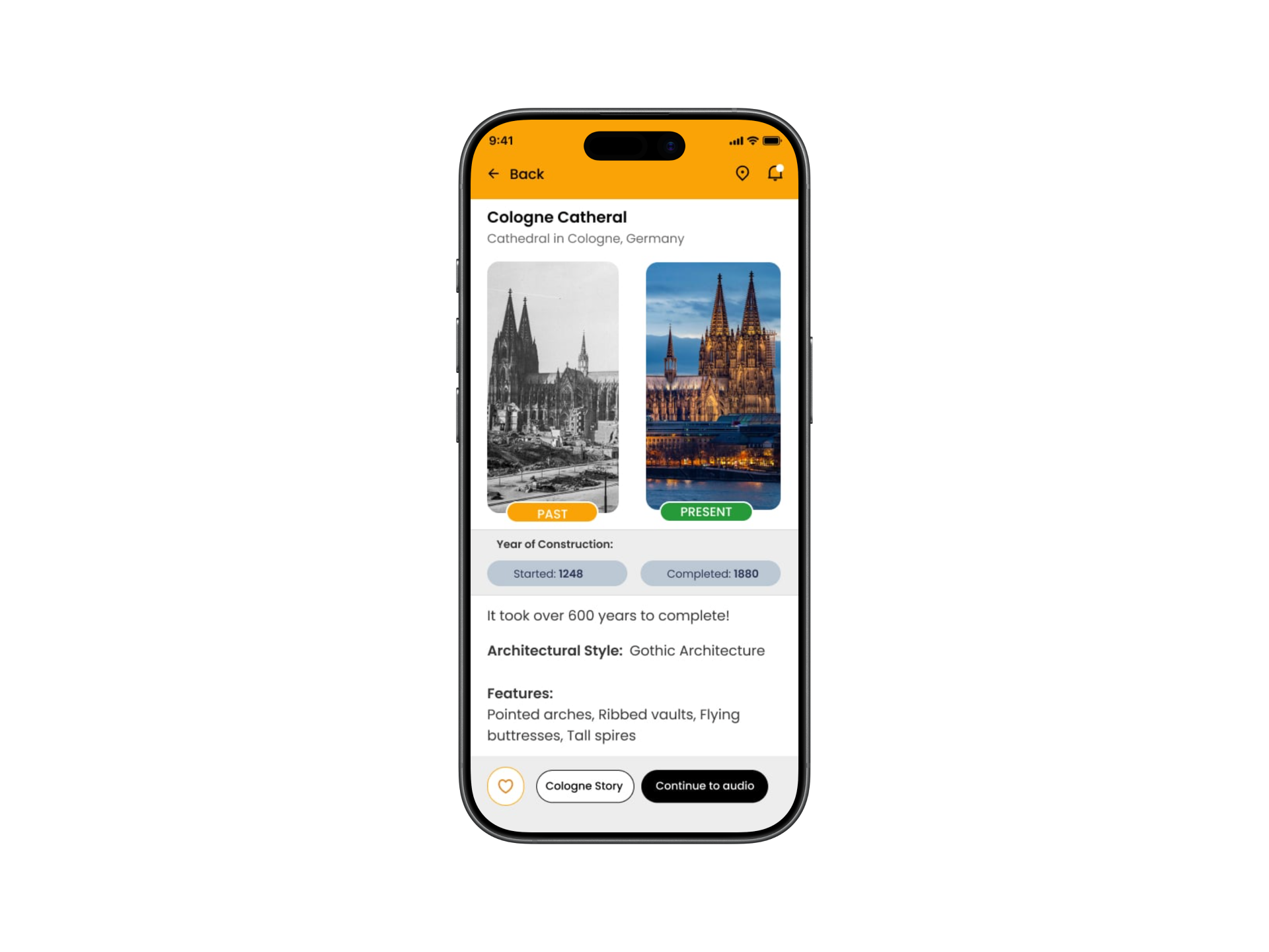
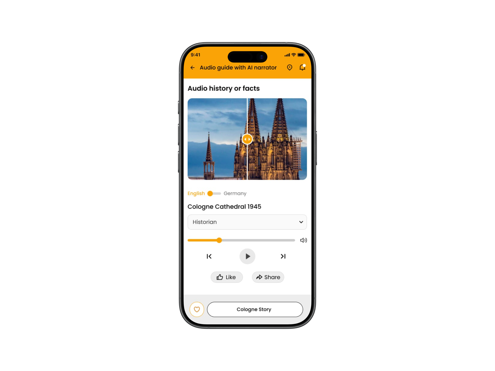
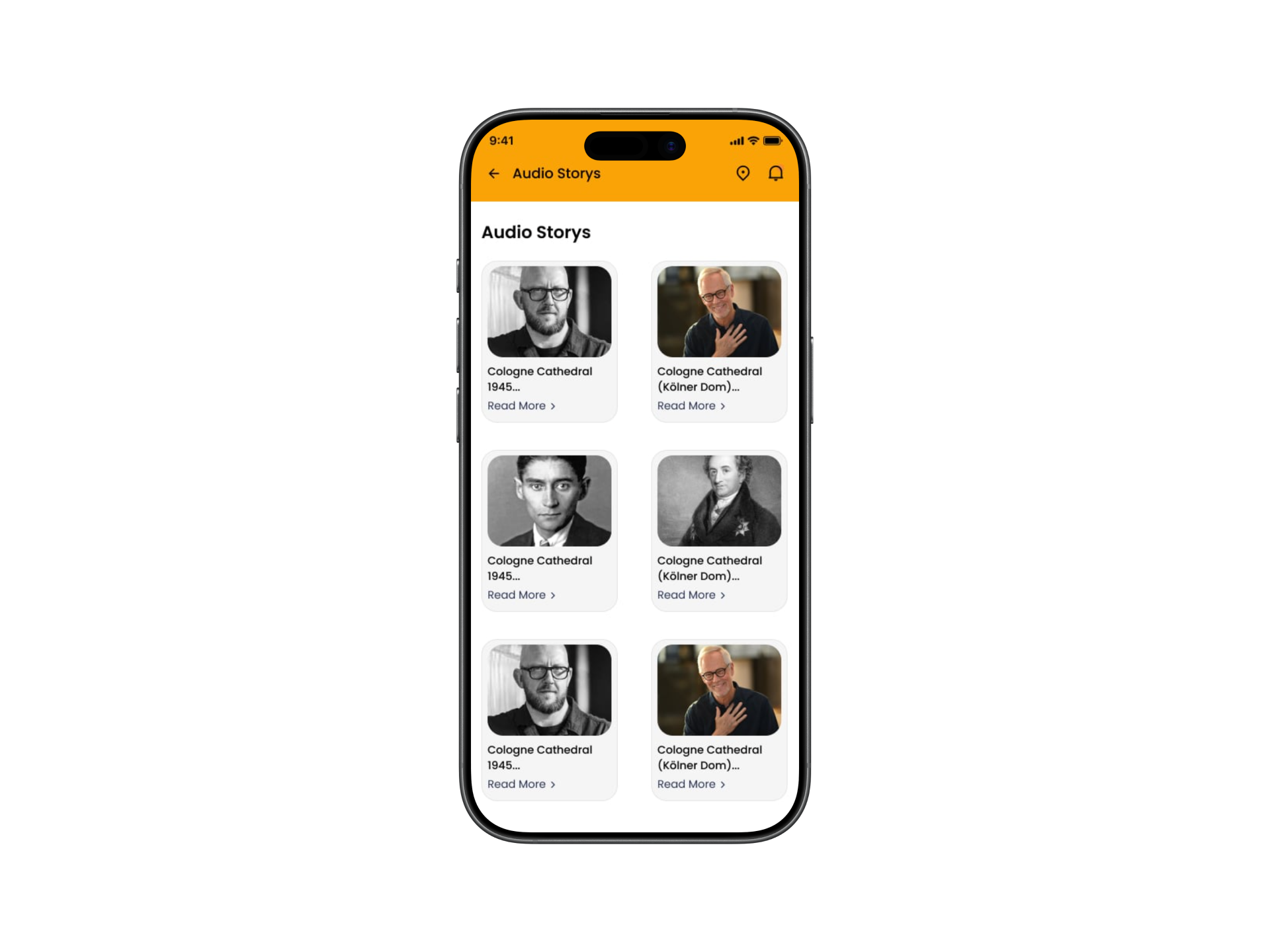
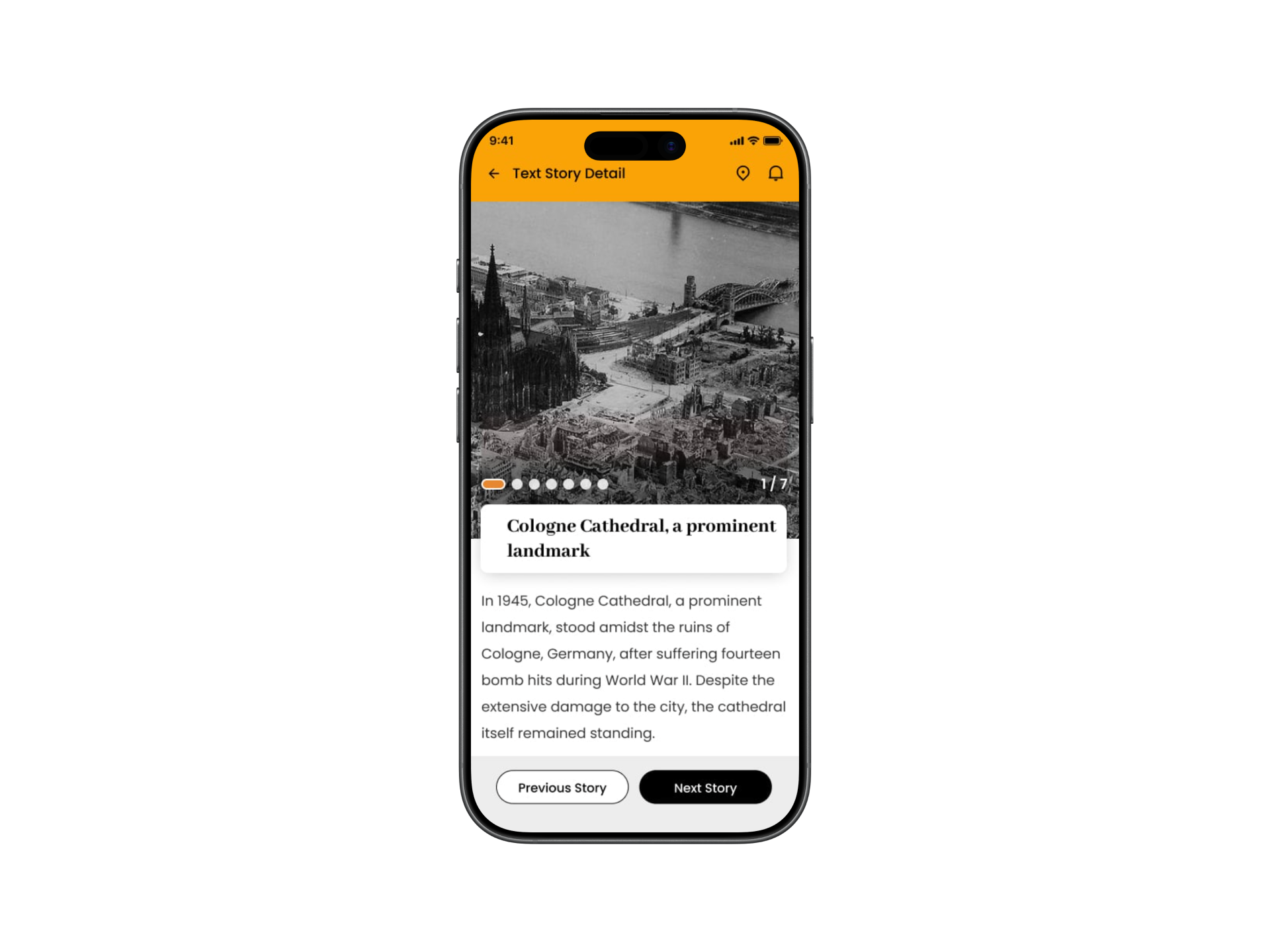
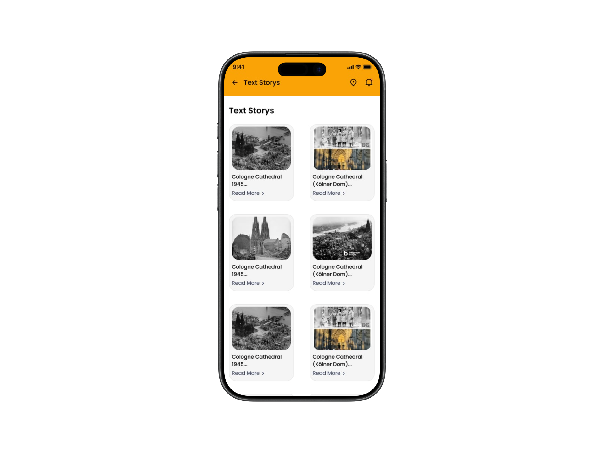
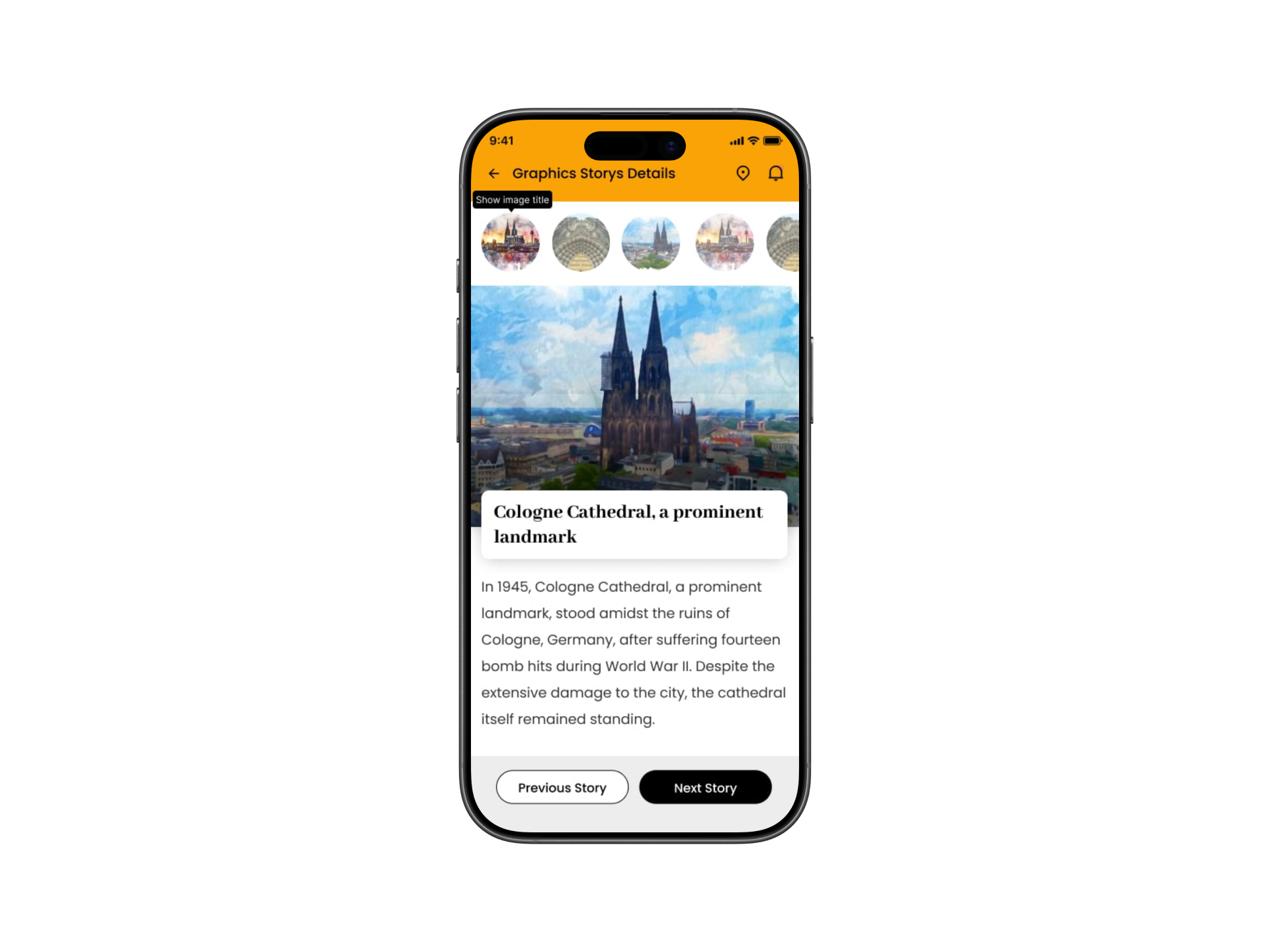
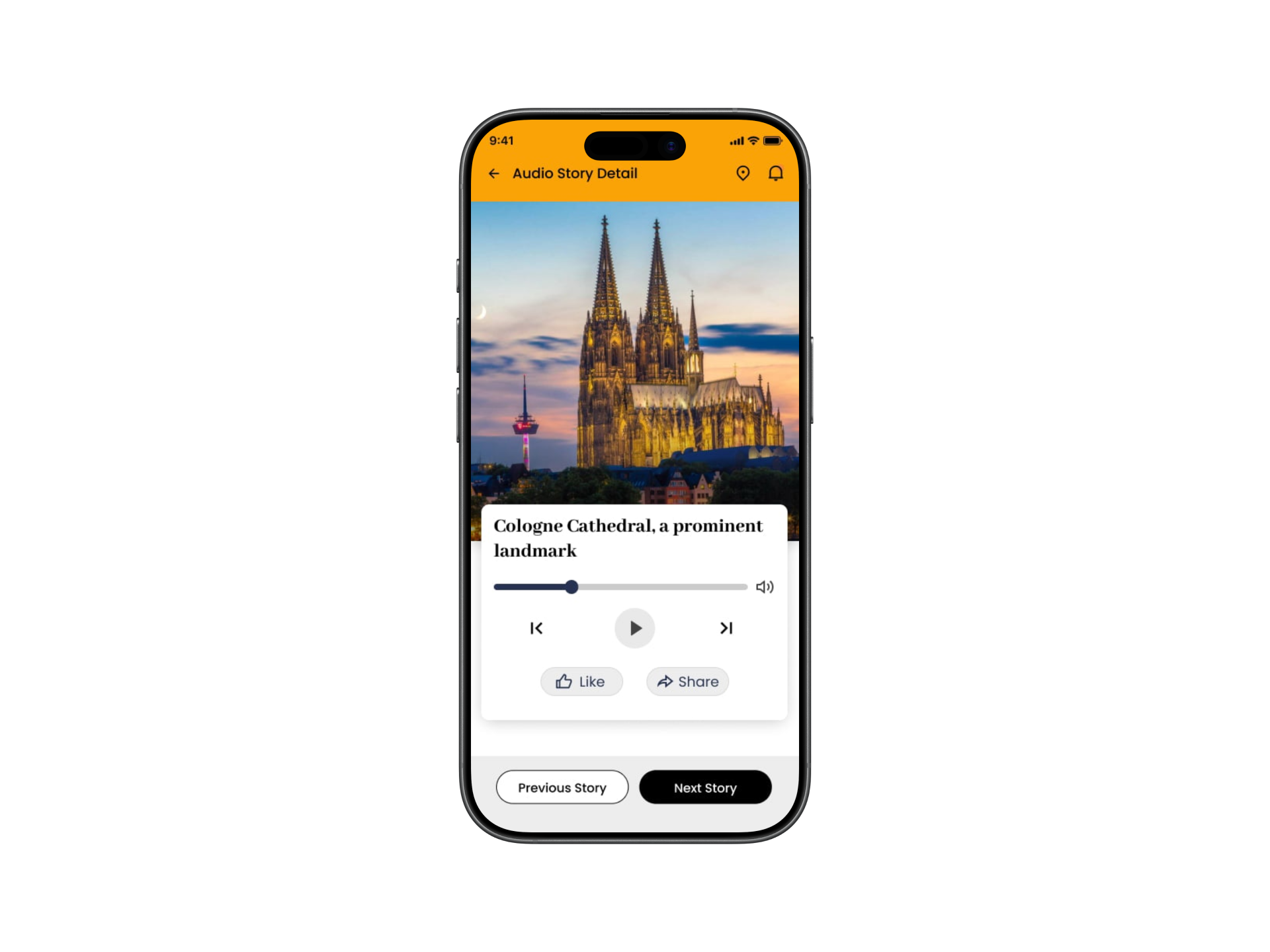
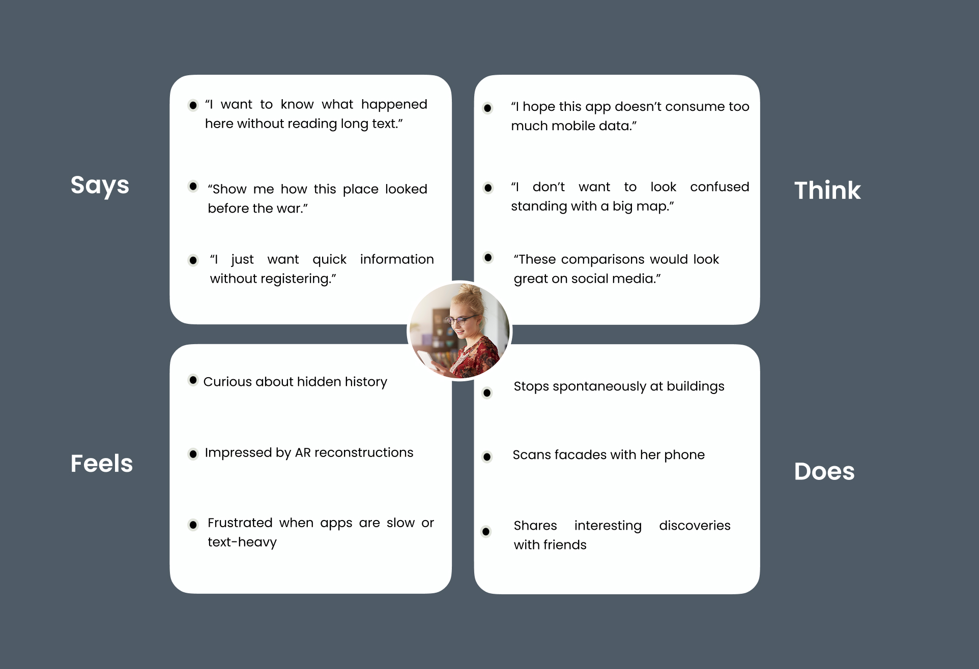
As a freelance concept project, KUBIK started from a defined proto-persona and empathy map — assumption-based tools I used to focus the design on one clear scenario: someone standing in front of a building, wanting instant context without effort. These are hypotheses to be validated, not field findings — but they kept every design decision anchored in a real situation.
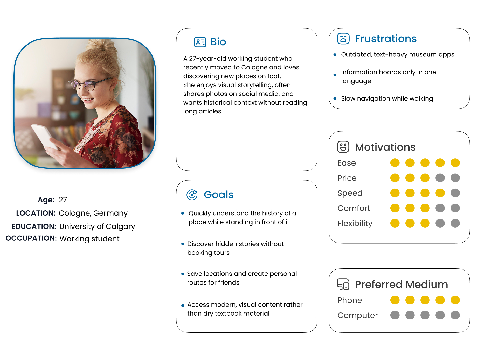
User Persona
A working student new to Cologne who loves discovering the city on foot, but finds existing history apps text-heavy and slow to use on the move.
Empathy Map
Mapping what she says, thinks, feels and does surfaced the core need: instant, visual context without effort — no registration, no long reads, no standing around looking lost.
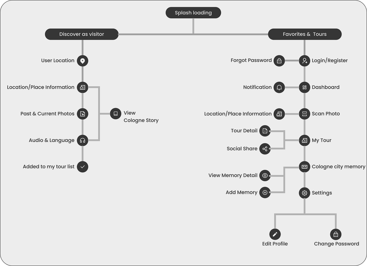
With the persona's needs defined, I mapped how users would move through the app — from spontaneously discovering a place to building and saving personal tours. The flow splits into two clear paths, keeping casual exploration and deeper engagement separate.
User Journey Flow
Two entry points shape the experience: Discover as visitor for instant, no-login exploration, and Favorites & Tours for saving places, building routes and revisiting Cologne's stories.
Swipe to explore →
With the flow in place, I moved from structure to screens — starting rough on paper, then building up to a full UI and a consistent style guide.
Wireframes
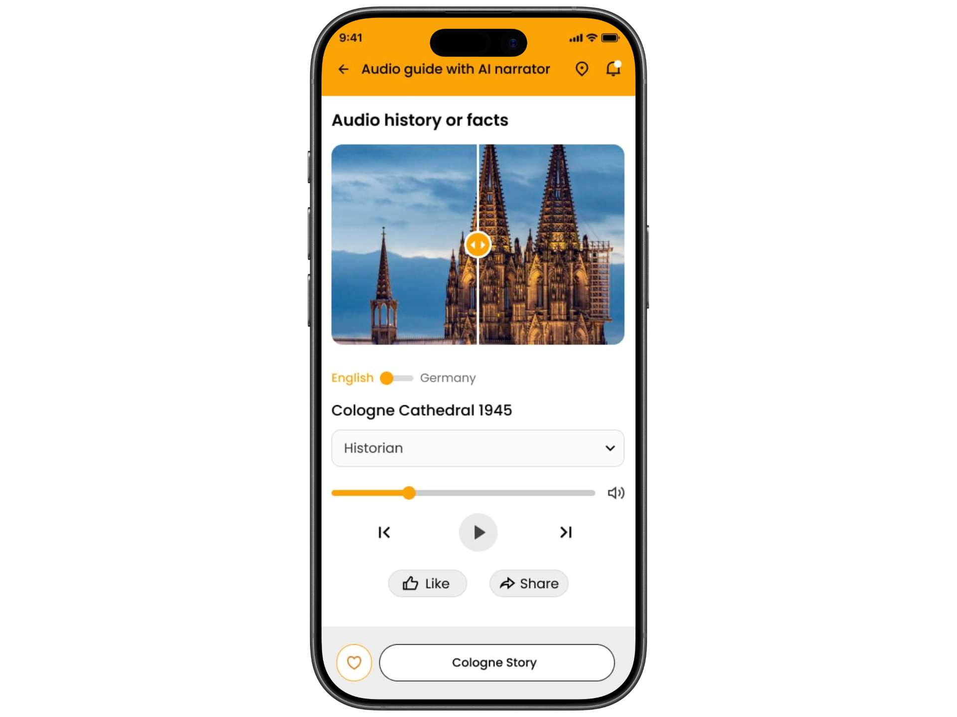
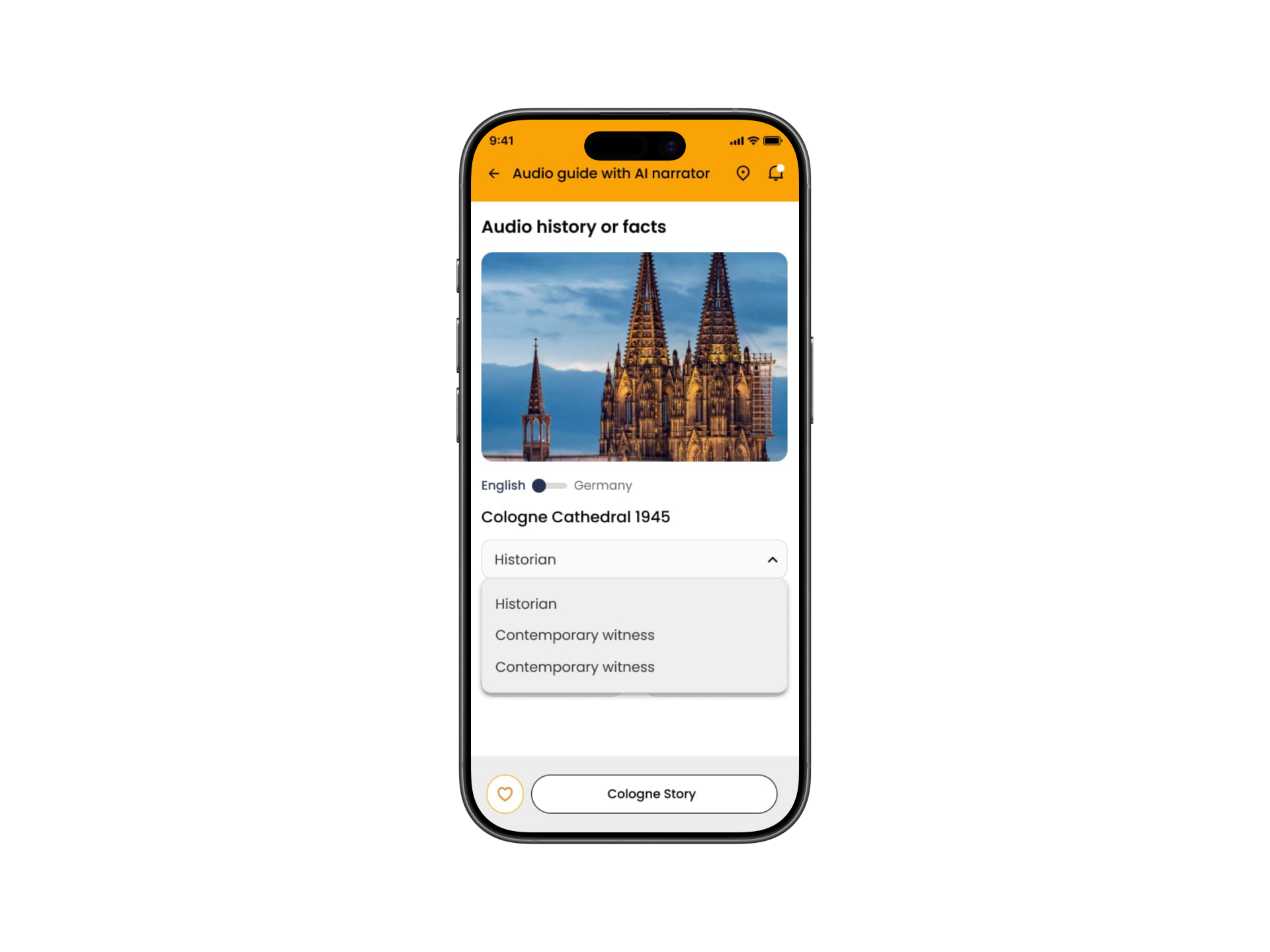
I began with low-fidelity paper sketches to test layout and hierarchy fast — the onboarding slider, place overview, the past-vs-present comparison and the audio-guide player all took shape here before any pixel work.
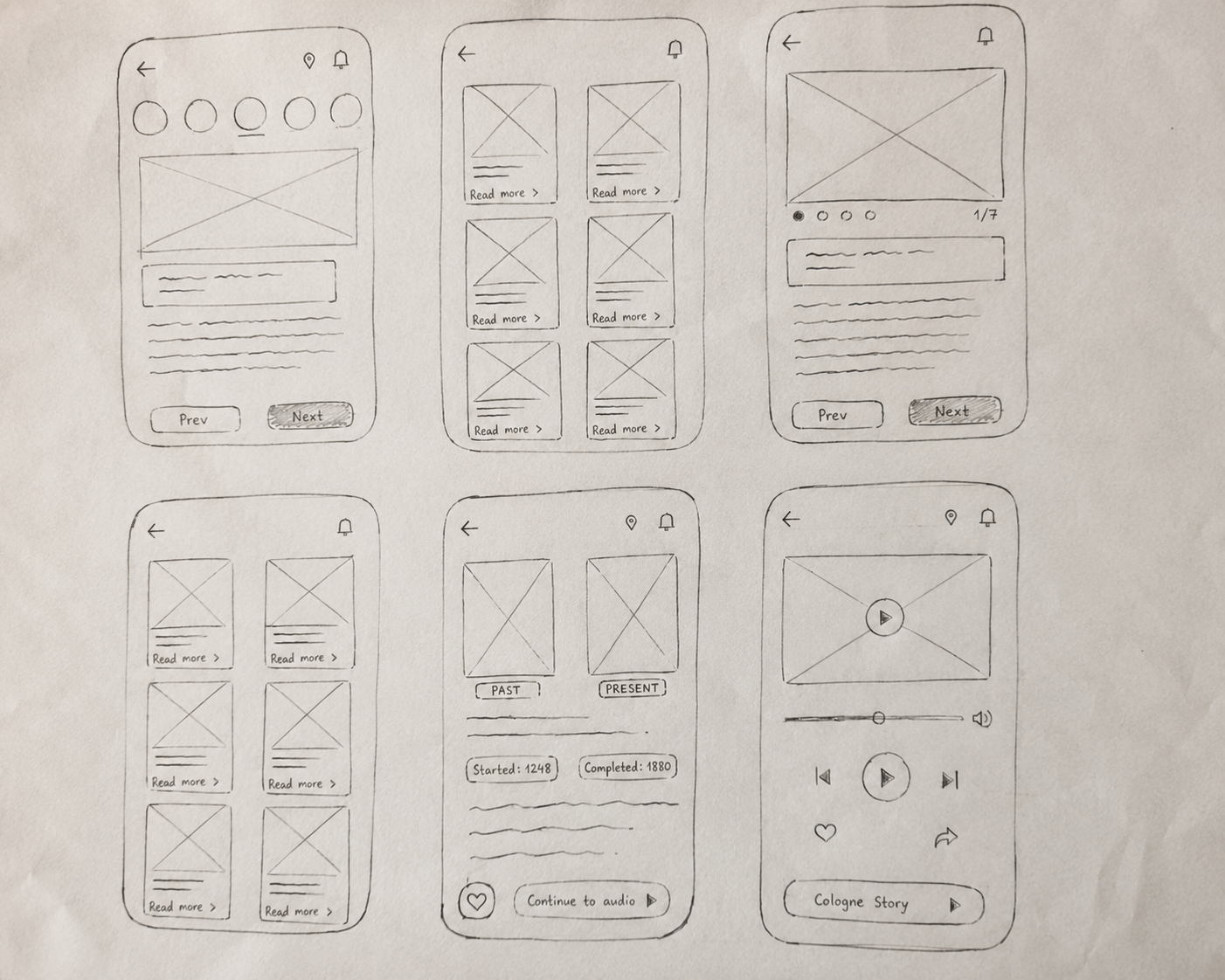
Low-fidelity paper sketches
Style Guide
The visual system is built for outdoor use: a warm orange accent that stays visible in sunlight, high-contrast dark text, and Poppins — chosen for its geometric structure and excellent readability on mobile screens on the move.
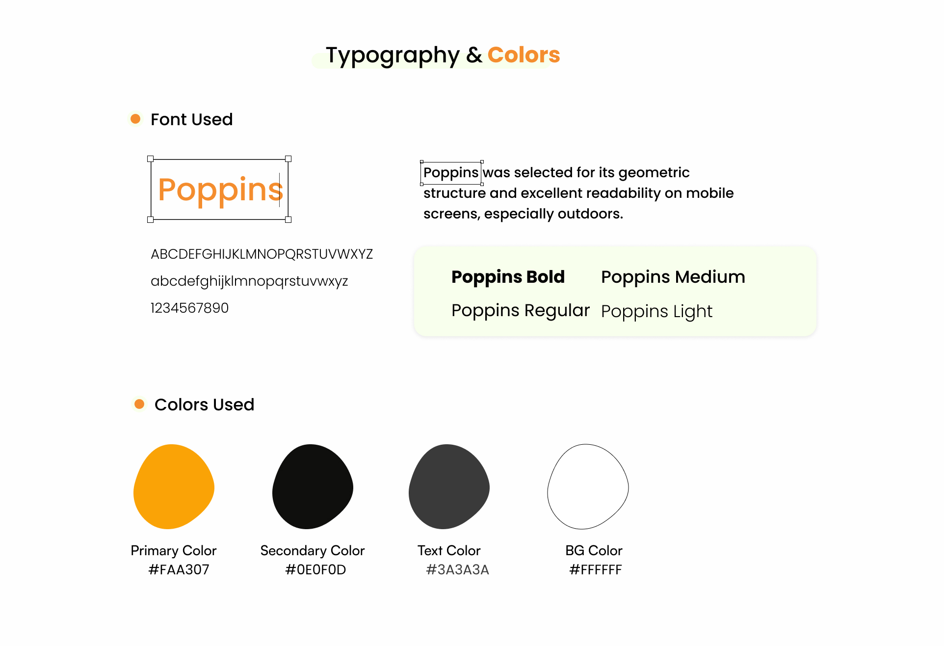
Typography & colors