UX/UI Case Study · Fintech · 2024
Pluto Pay
A fintech mobile app designed to help users manage their subscriptions and expenses.
Role
UX/UI Designer
Duration
4 Weeks
Type
Solo Project
PlutoPay

What is PlutoPay?

PlutoPay is a fintech mobile app concept that helps young adults track shared expenses and split bills effortlessly. Designed solo over 4 weeks — from research to high-fidelity prototype in Figma.

The Problem

Splitting expenses in groups is messy. People lose track of who paid what, reminders feel awkward, and existing apps are cluttered with features nobody uses.

The Goal

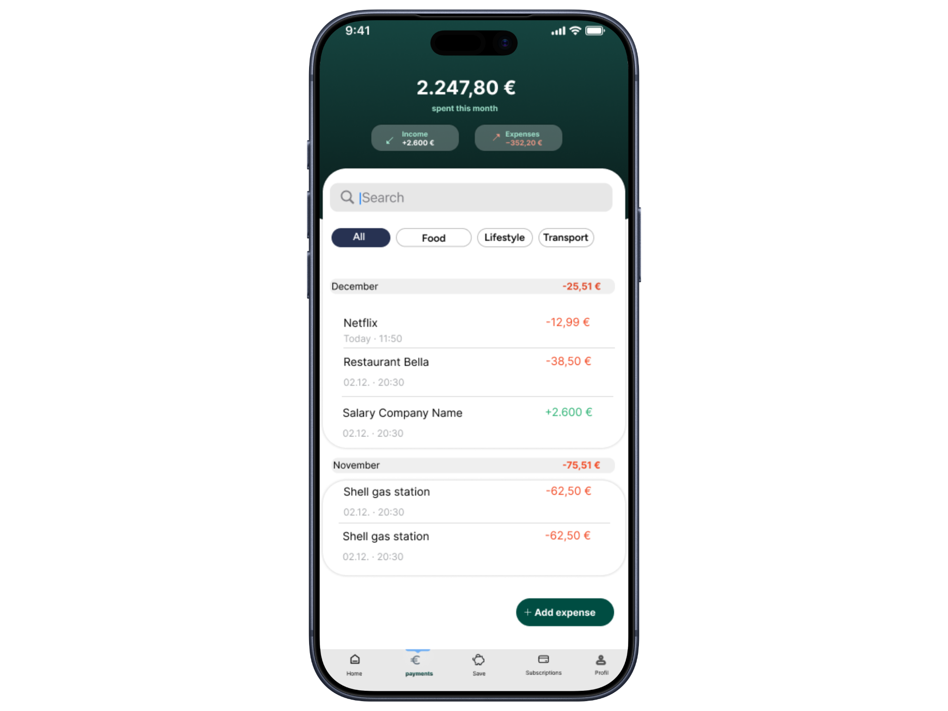
Create a clean, trustworthy app that makes adding an expense take under 10 seconds — with clear balances at a glance and zero awkwardness when settling up.

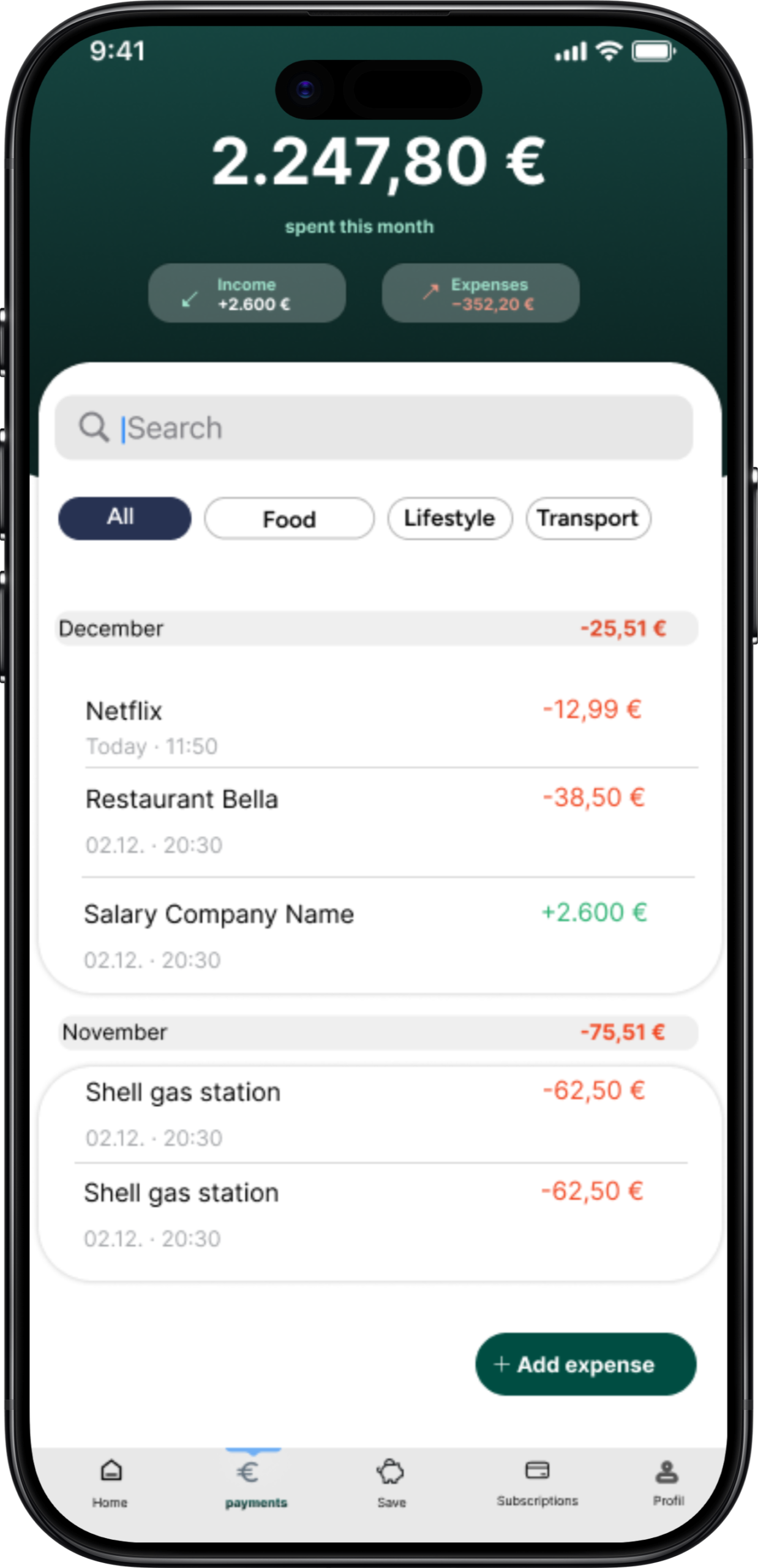
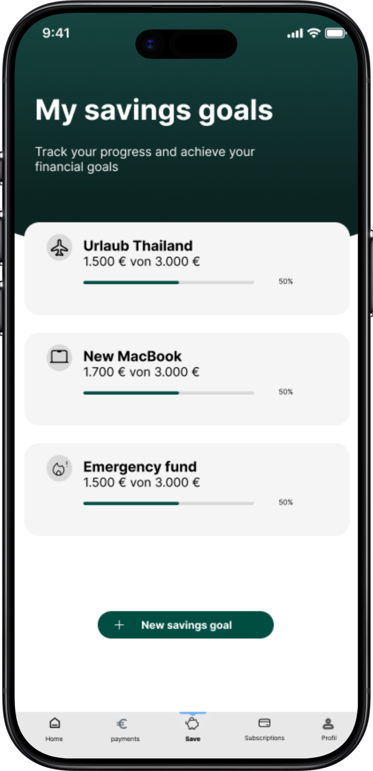
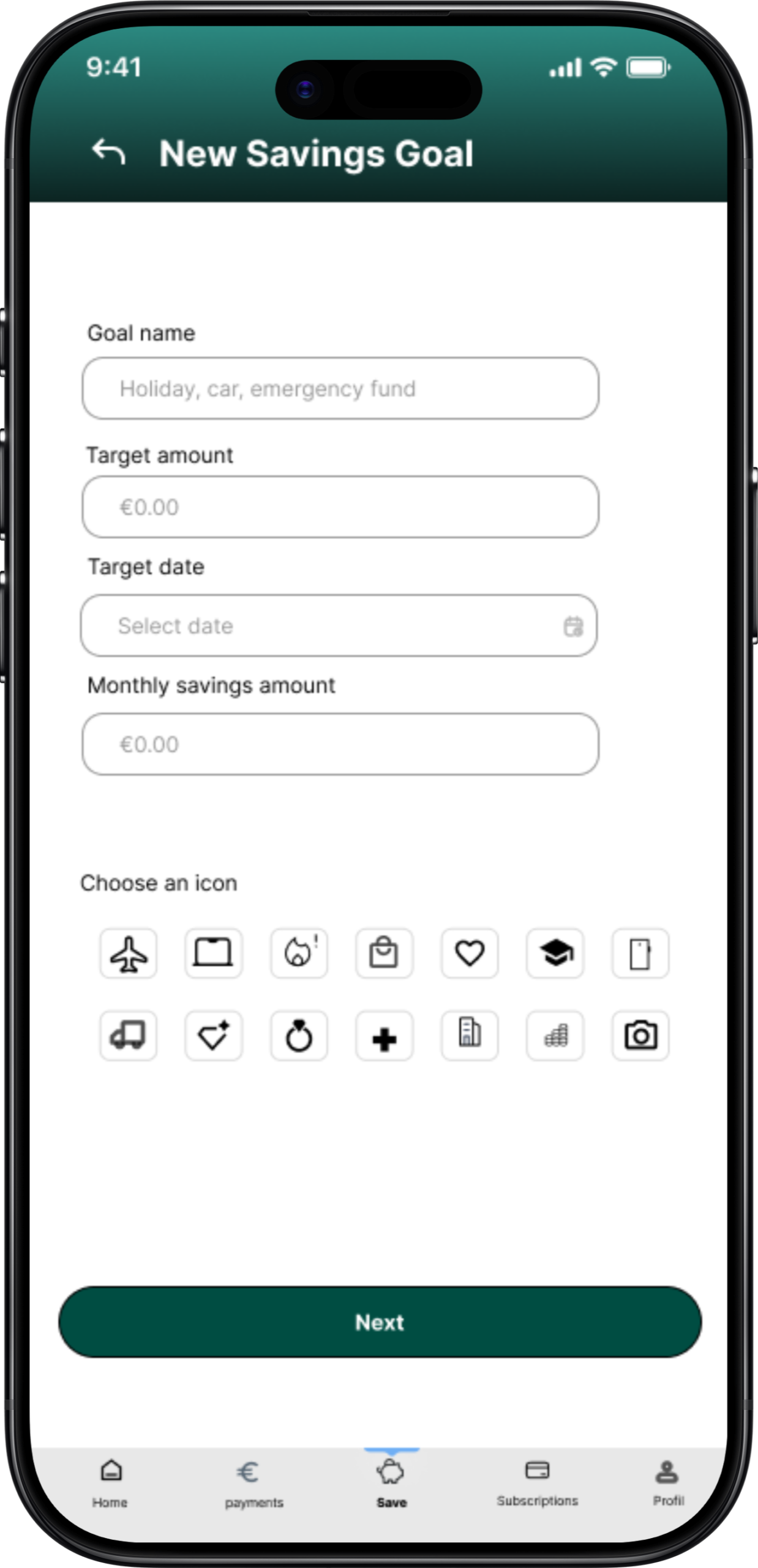
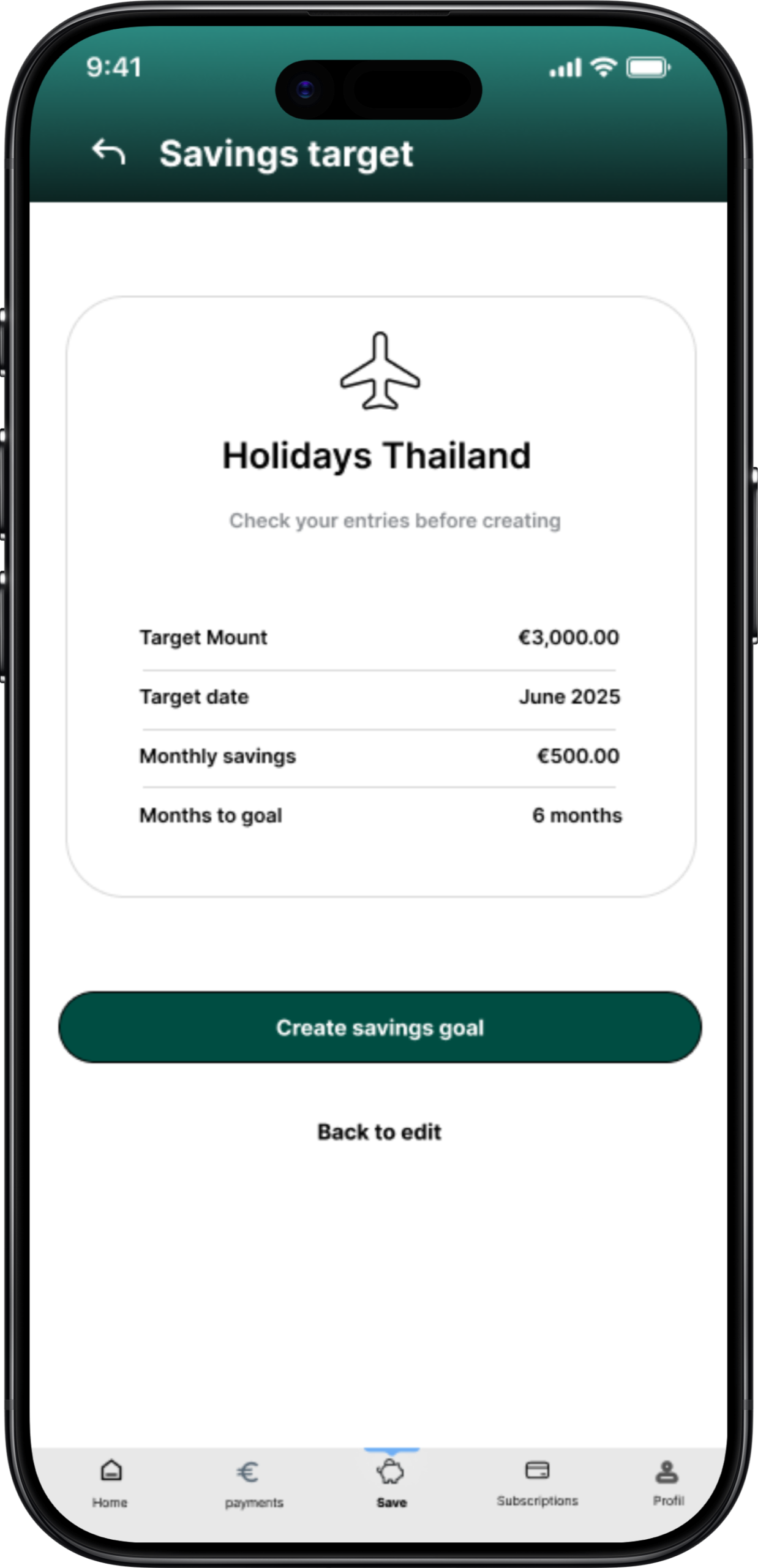
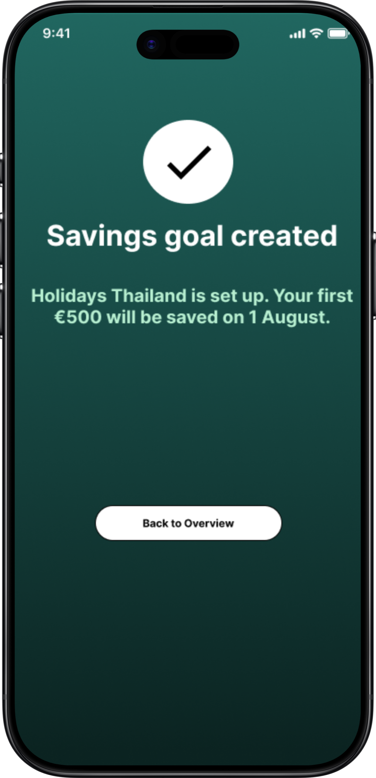
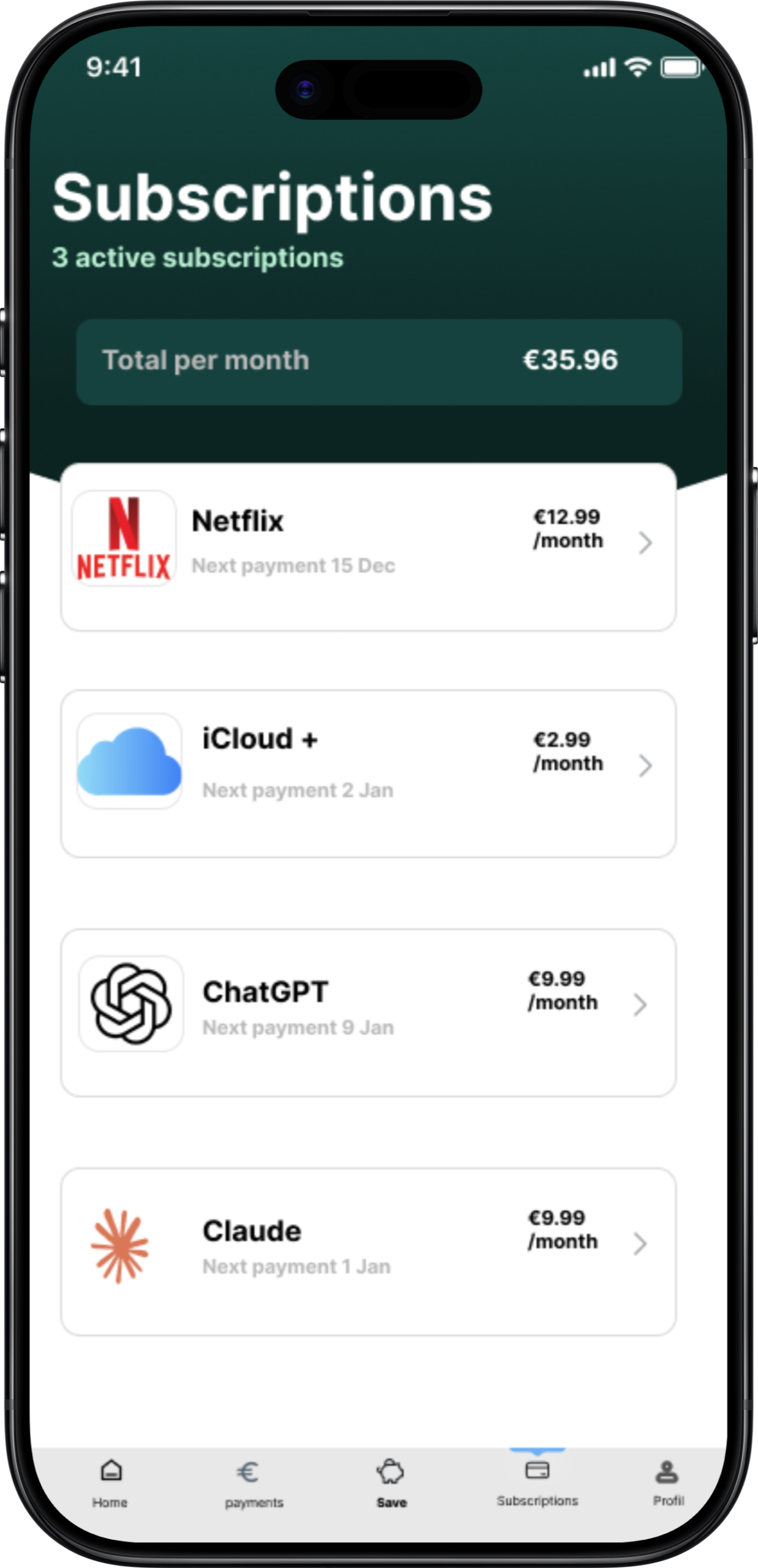
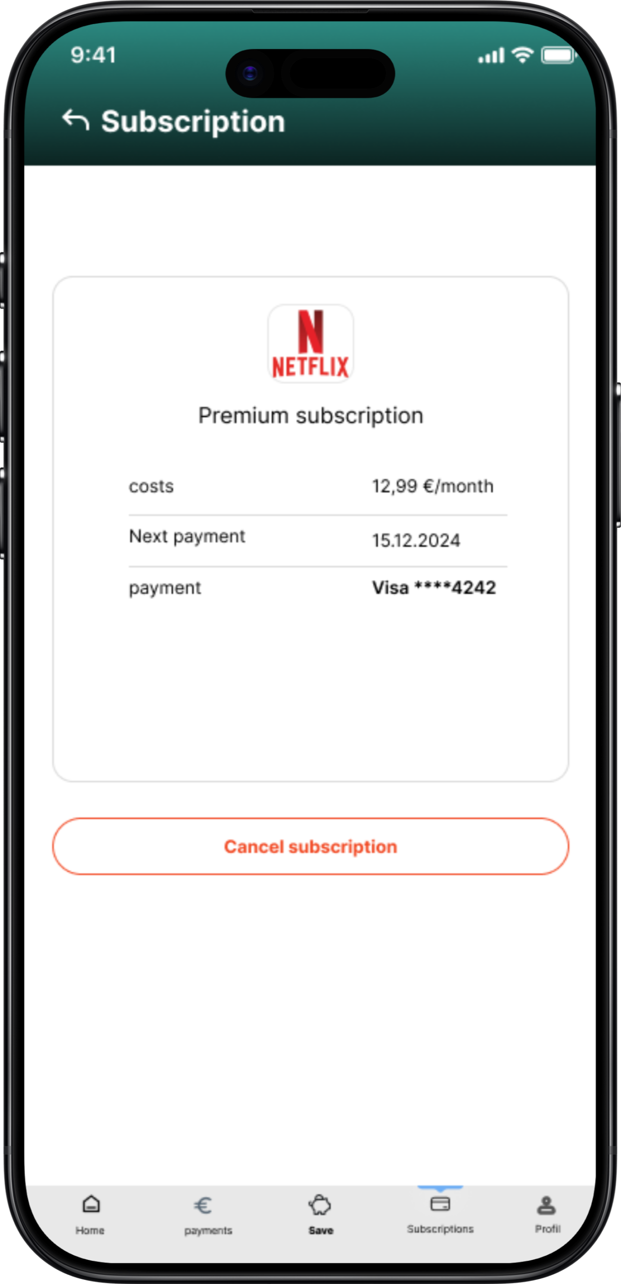
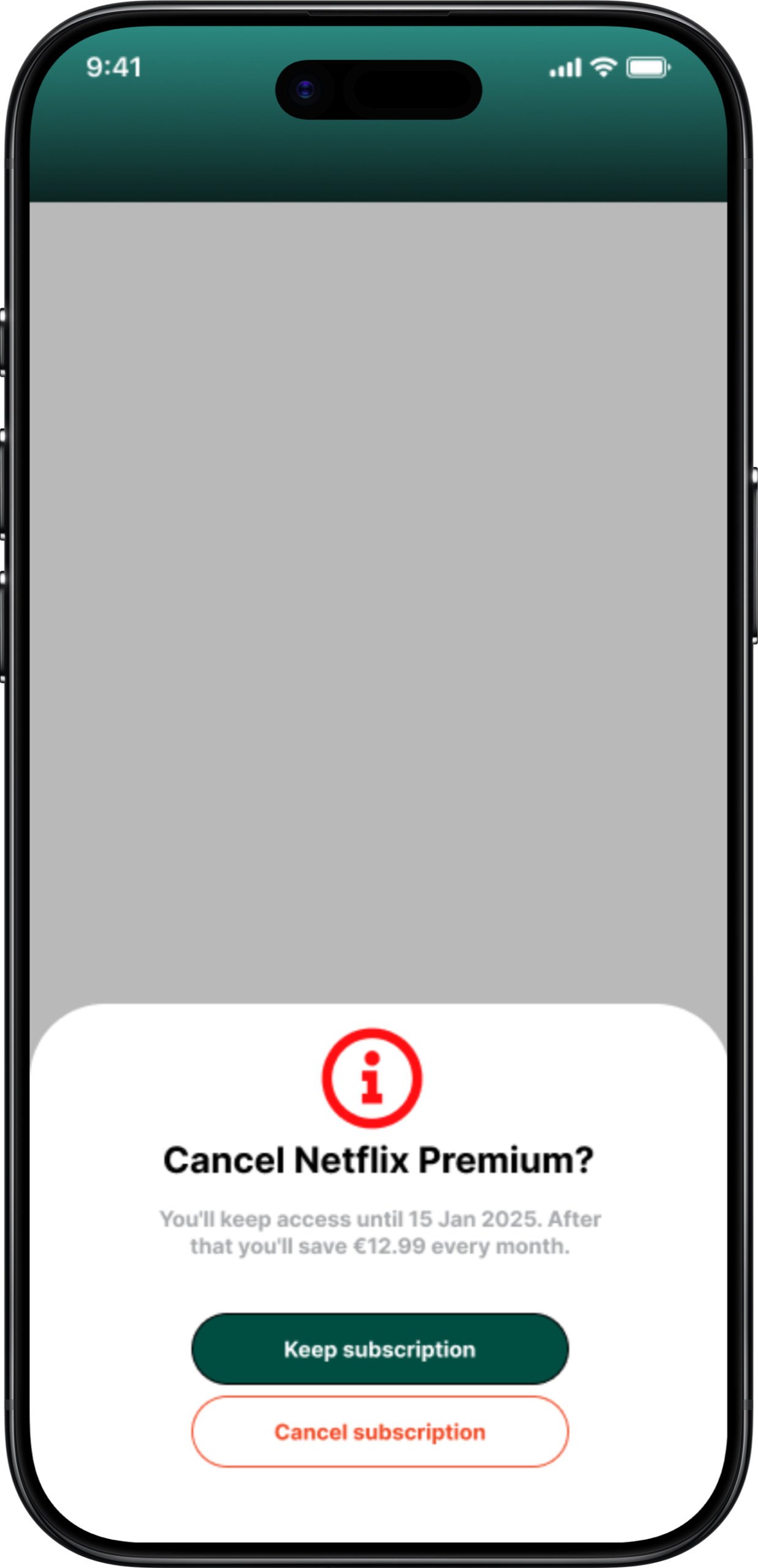
PlutoPay Screen 1 PlutoPay Screen 2 PlutoPay Screen 3 PlutoPay Screen 4 PlutoPay Screen 5 PlutoPay Screen 6 PlutoPay Screen 7 PlutoPay Screen 8 PlutoPay Screen 9 PlutoPay Screen 10
Research

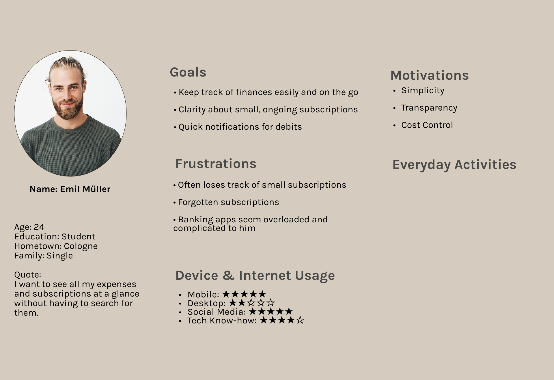
User interviews revealed three recurring frustrations around managing subscriptions and expenses — these insights shaped every design decision that followed.

No overview of active subscriptions

Users lose track of what they pay for — forgotten free trials and unused services quietly drain their budget every month.

Too many clicks to find details

Banking apps bury key information. Checking a single payment means digging through endless transaction lists.

No reminders before renewals

Subscriptions renew silently. Users want a warning before money leaves their account — not a surprise after.

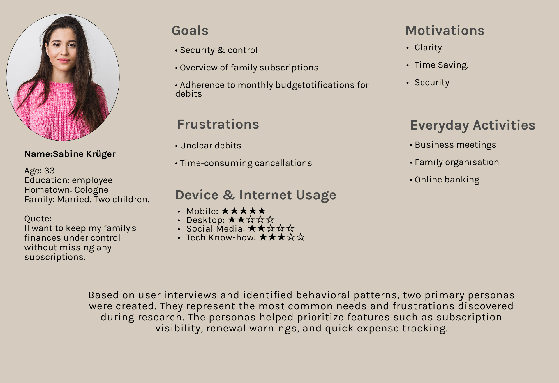
User Personas
User Persona 1 User Persona 2

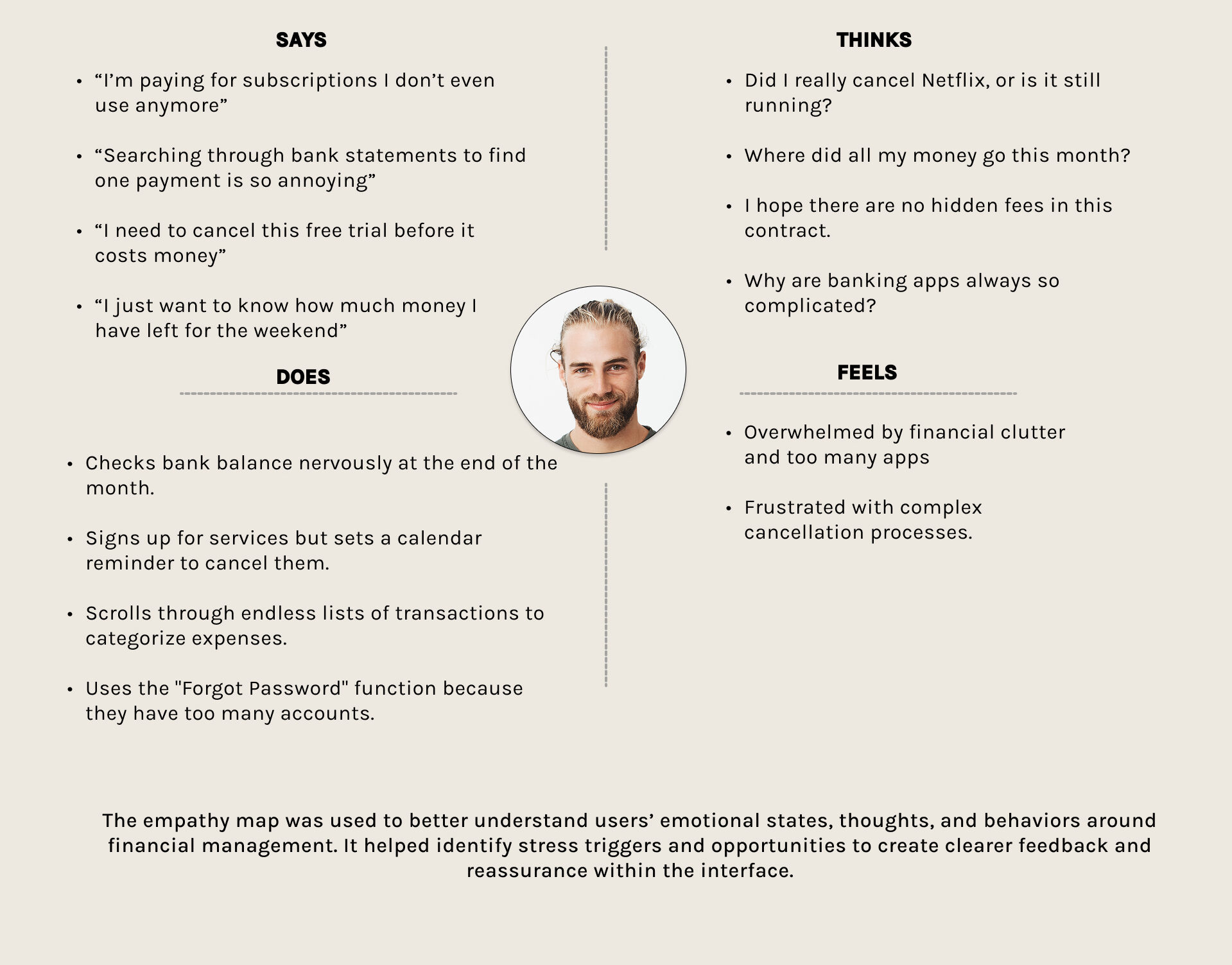
Empathy Mapping

Mapping out what users say, think, do and feel gave me a deeper perspective on their pain points around managing money. It revealed clear stress triggers — silent renewals, confusing cancellations, endless transaction lists and showed where the interface needed to provide clarity and reassurance.
Empathy Map

Swipe to explore →

Ideation
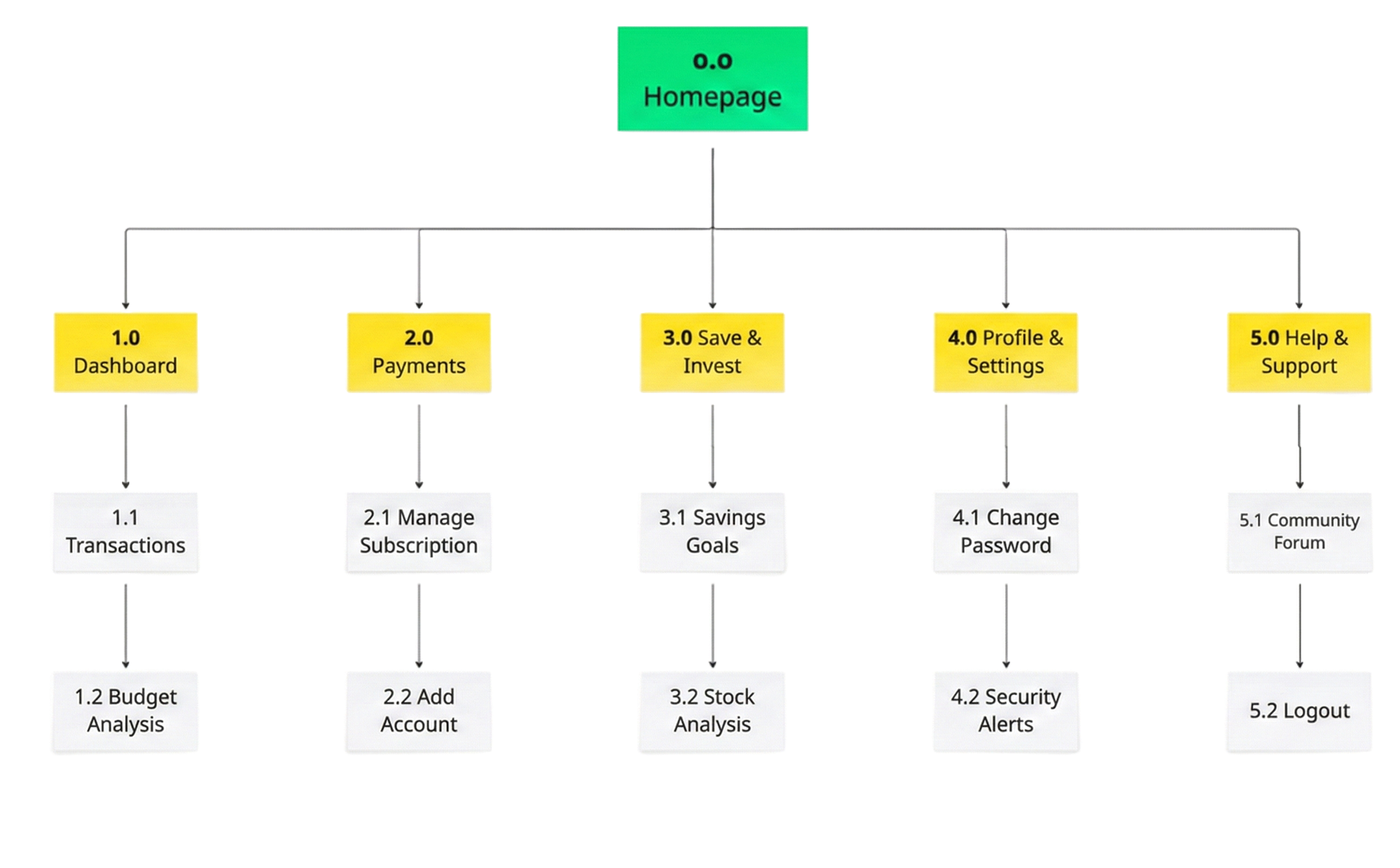
PlutoPay Site Map

Swipe to explore →

Site Map

After understanding my users' needs, I structured PlutoPay around five core areas — Dashboard, Payments, Savings, Profile and Support. The goal: keep subscriptions and expenses just one tap away, so managing money never feels overwhelming.

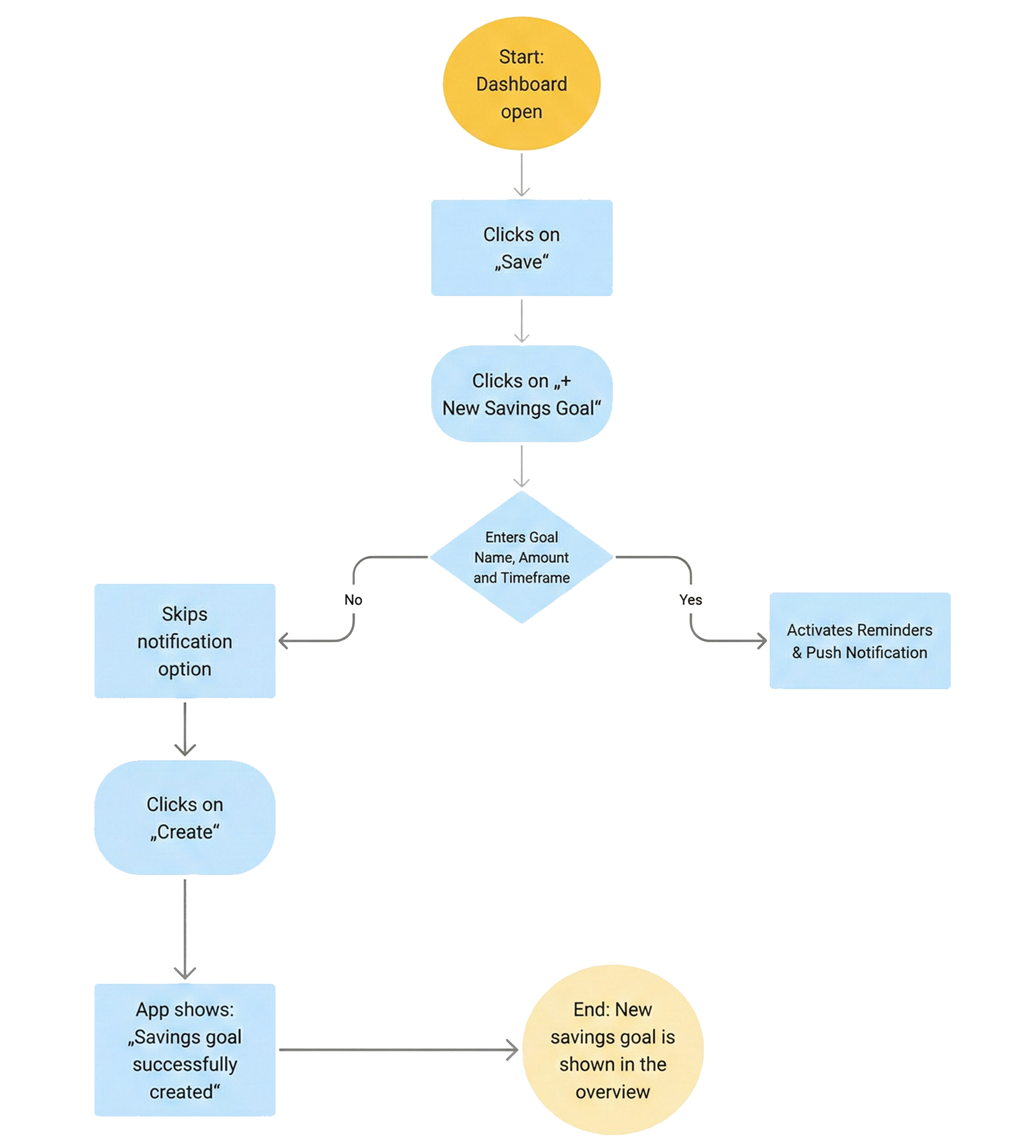
User Flows

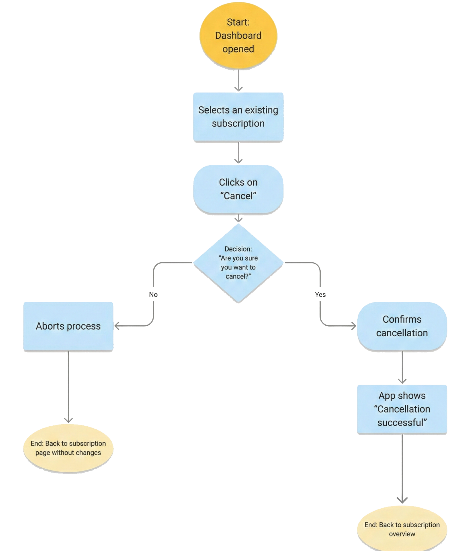
Starting from the sitemap, I mapped out the three most frequent tasks users would perform. Each flow was designed to reach its goal in as few steps as possible — with clear feedback at every decision point.
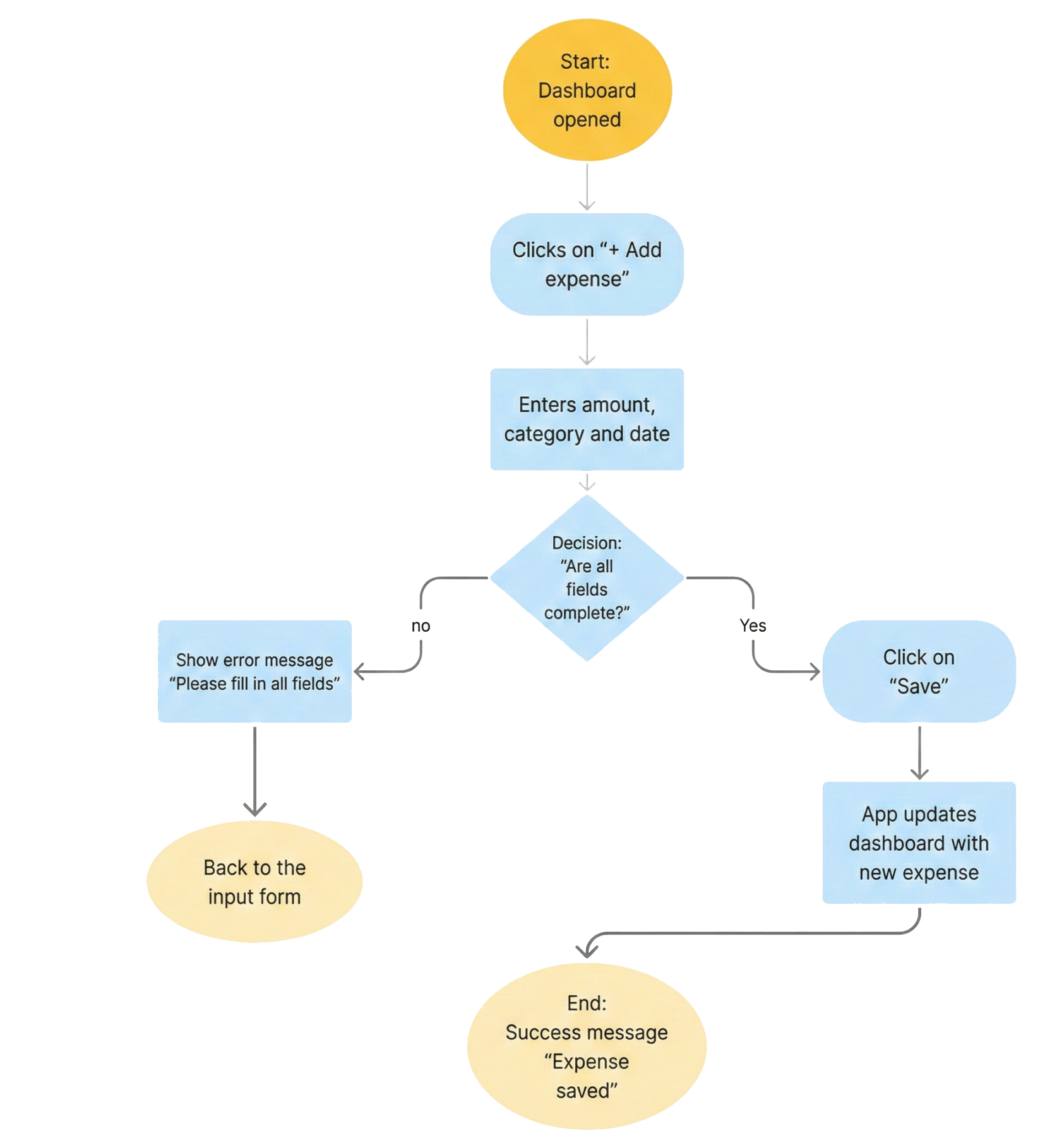
01 — Add a new expense
User Flow 1 — Add a new expense
02 — Cancel a subscription
User Flow 2 — Cancel a subscription
03 — Create a savings goal
User Flow 3 — Create a savings goal
Design

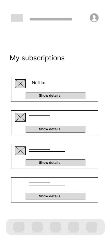
Wireframes

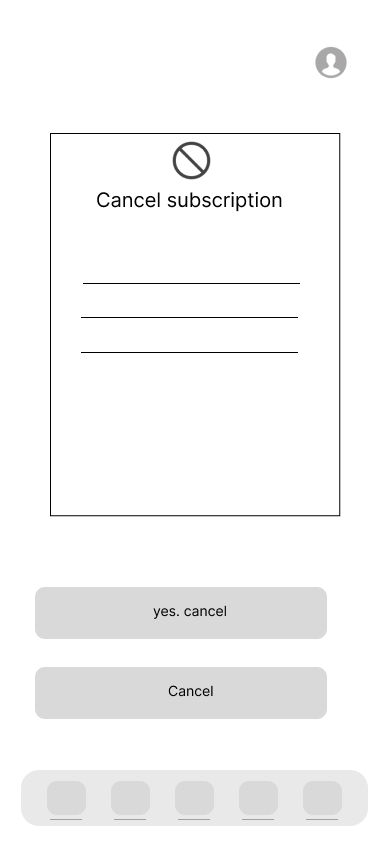
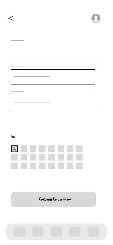
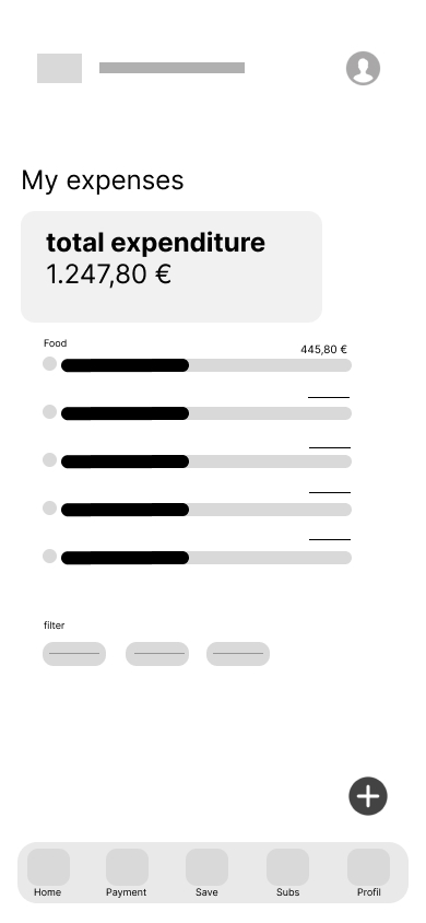
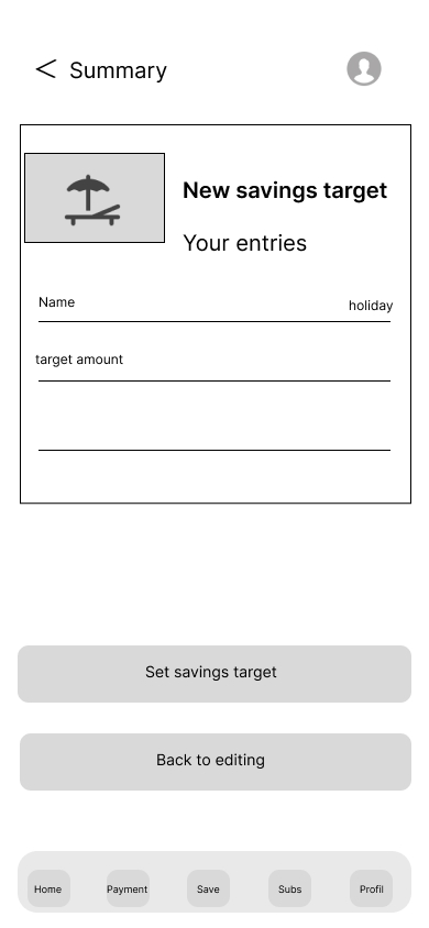
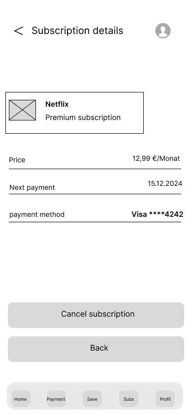
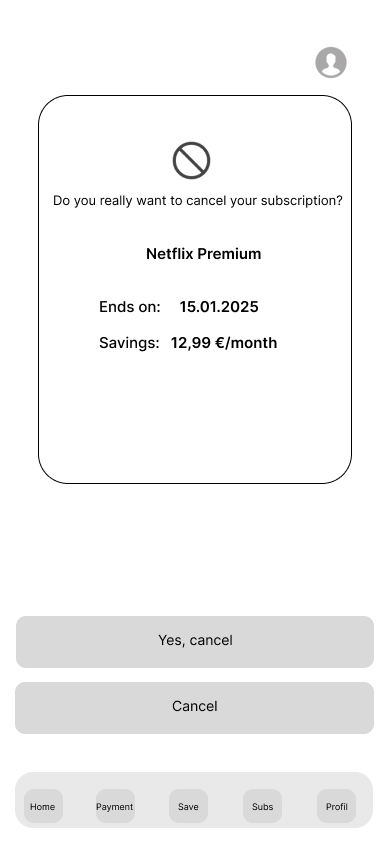
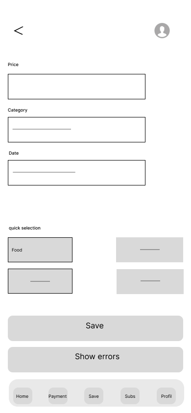
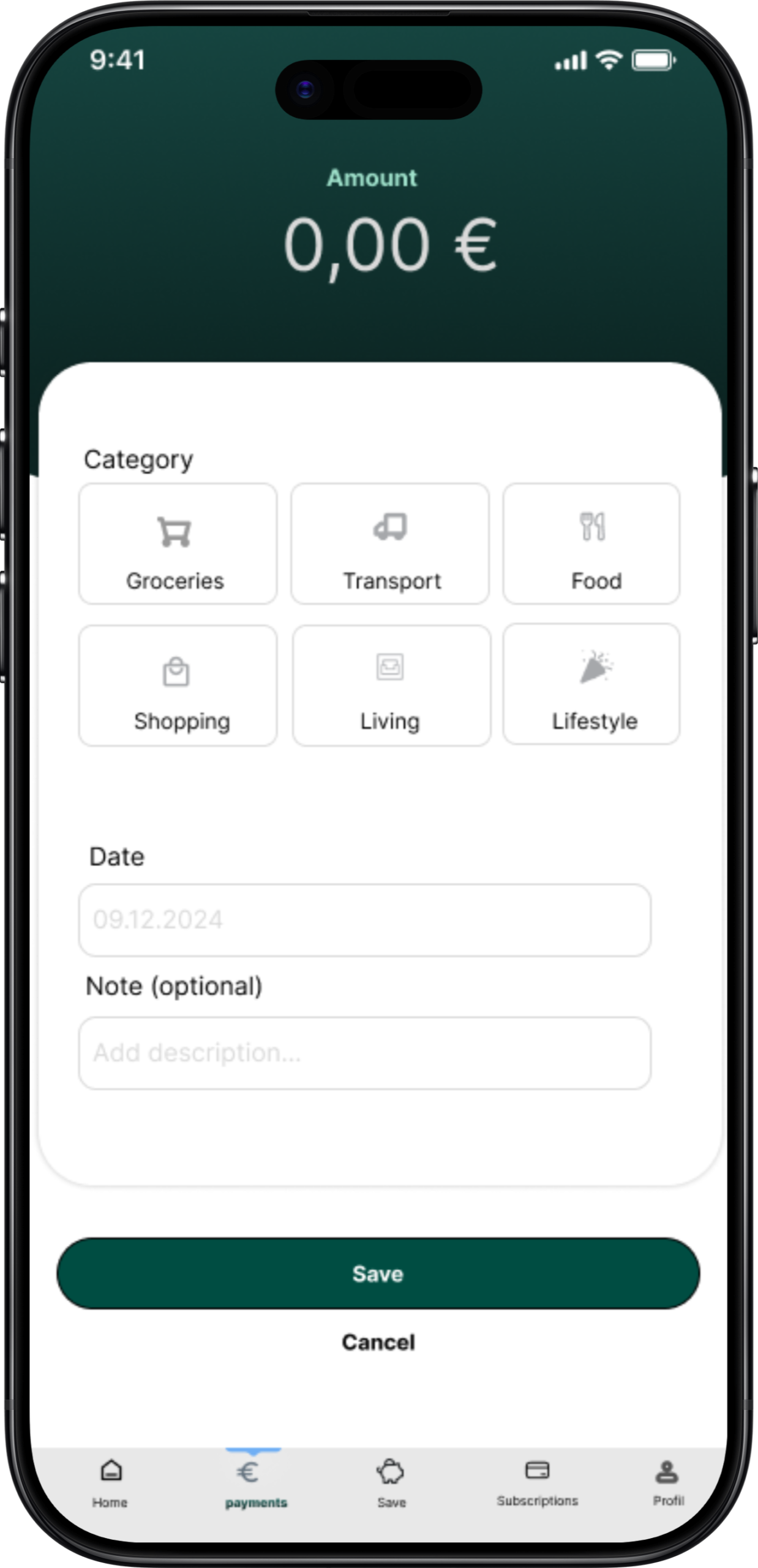
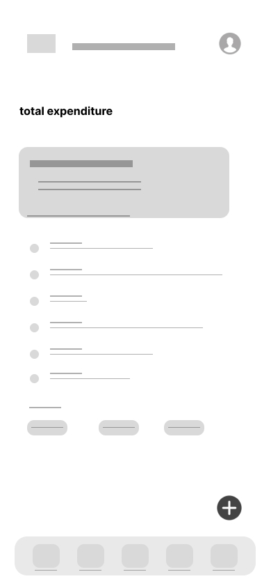
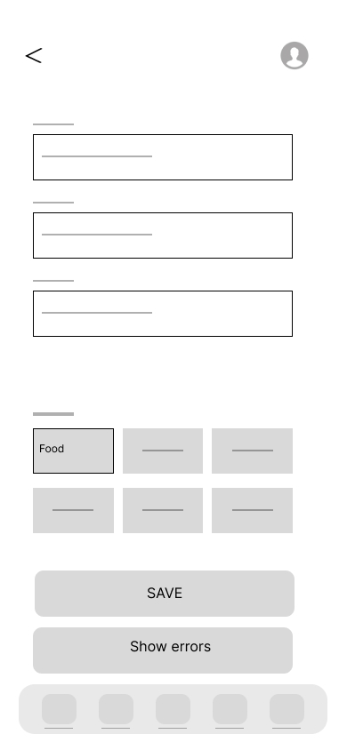
Based on the user flows and sitemap, I started with low-fidelity wireframes to define layout and hierarchy — then refined them into mid-fidelity with real content, labels and navigation. Several details changed between the two stages, like clearer category selection and labeled tab bar items.
Low-Fidelity
Lo-Fi Wireframe — Dashboard Lo-Fi Wireframe — Add expense Lo-Fi Wireframe — Subscriptions Lo-Fi Wireframe — Login Lo-Fi Wireframe — Onboarding
Mid-Fidelity
Mid-Fi Wireframe — My expenses Mid-Fi Wireframe — New savings target Mid-Fi Wireframe — Subscription details Mid-Fi Wireframe — Cancel subscription Mid-Fi Wireframe — Add expense
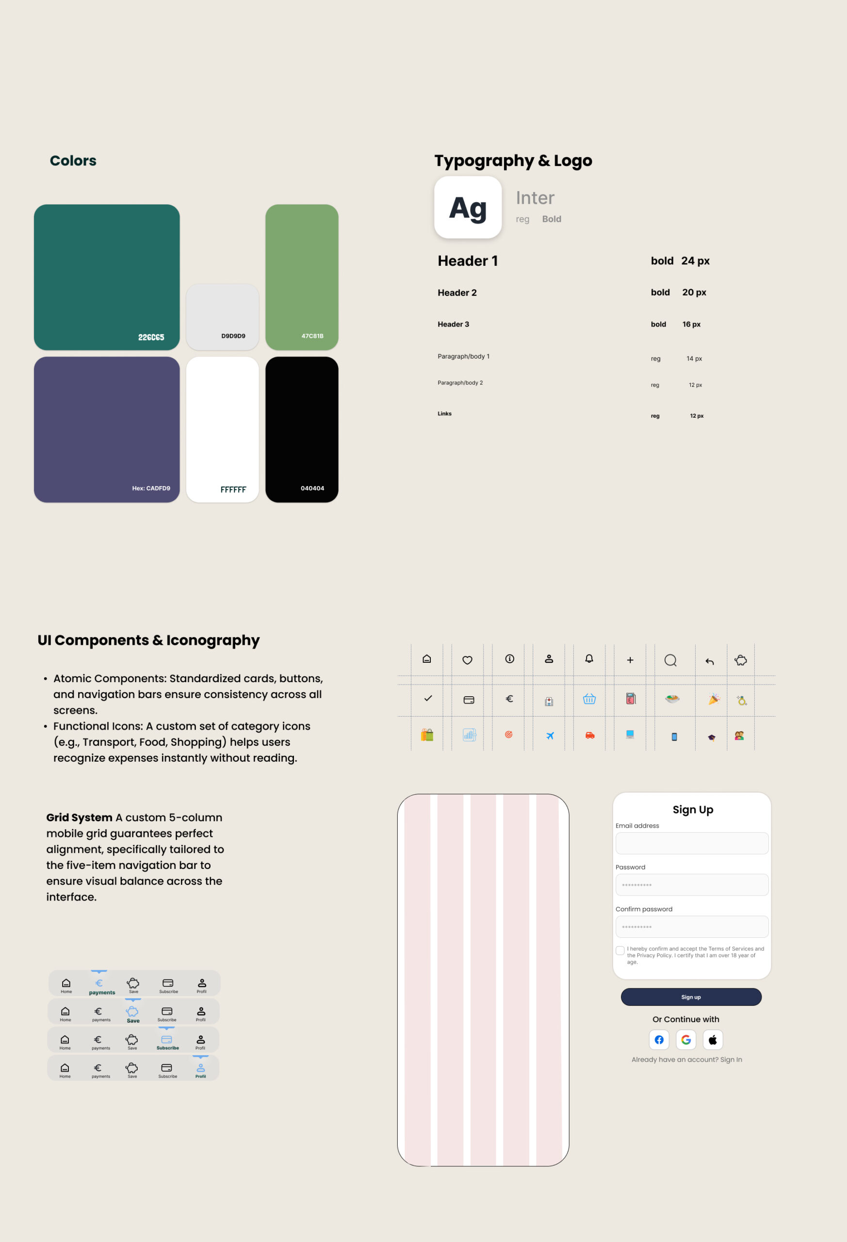
PlutoPay Design System — Colors, Typography, Components

Swipe to explore →

Style Guide


I built a design system with atomic components,standardized cards, buttons and navigation bars reused across all screens. The green color palette was chosen to signal trust and financial stability, paired with Inter for clear readability at small sizes. A custom 5-column grid keeps the five-item navigation perfectly balanced, and category icons help users recognize expenses instantly — without reading.
Prototype

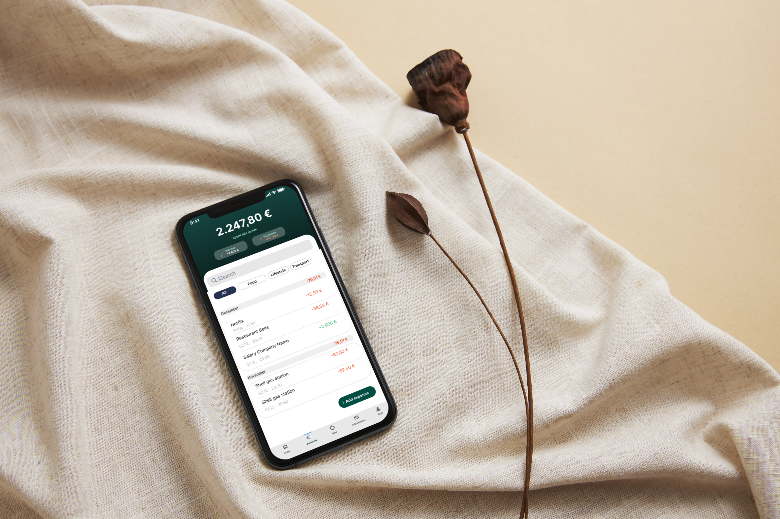
I built a clickable prototype in Figma covering the core flows — adding an expense, managing subscriptions and creating a savings goal. Try it yourself below.

Testing

Usability Testing

I conducted moderated usability tests with 3 participants (10–15 minutes each), using the Figma prototype with screen recording. Participants completed realistic tasks — creating an expense, managing and cancelling a subscription, and setting up a savings goal — while I observed orientation, navigation and friction points.

Key findings

Cancel option was hard to find

All participants found the cancellation — but only after searching. The option felt hidden within the subscription details.

Hesitation when picking a category

Creating an expense worked well overall, but participants briefly paused at the category selection step.

Users wanted clearer feedback

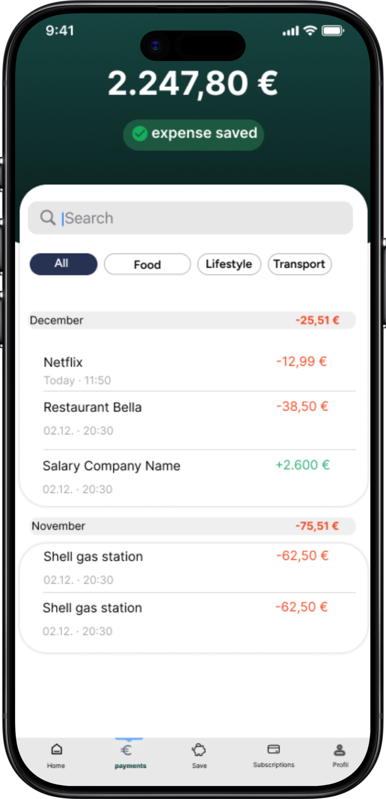
After sensitive actions like cancelling, participants expected an extra confirmation and clearer system feedback.

PlutoPay App