UX/UI Case Study · Non-Profit Platform · Live Project
SAM

A platform for exchanging and managing relief supplies between aid organizations — designed with a team of 11 for a real client, now live on the web.
My Role
UI Design, Video, Hi-Fi
Duration
4 Months
Team
11 People
Client
SAM e.V.
Tools
Figma, Slack, After Effects
SAM Platform

Problem

Aid organizations constantly exchange relief supplies — but the coordination happens through scattered phone calls, emails and spreadsheets. Charities lose track of who needs what, requests get lost, and urgently needed goods sit unused in warehouses while other organizations search for exactly those items.

Solution

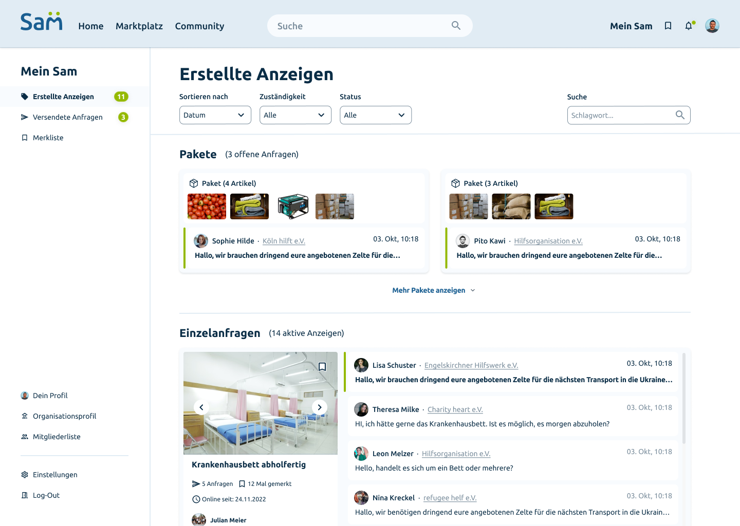
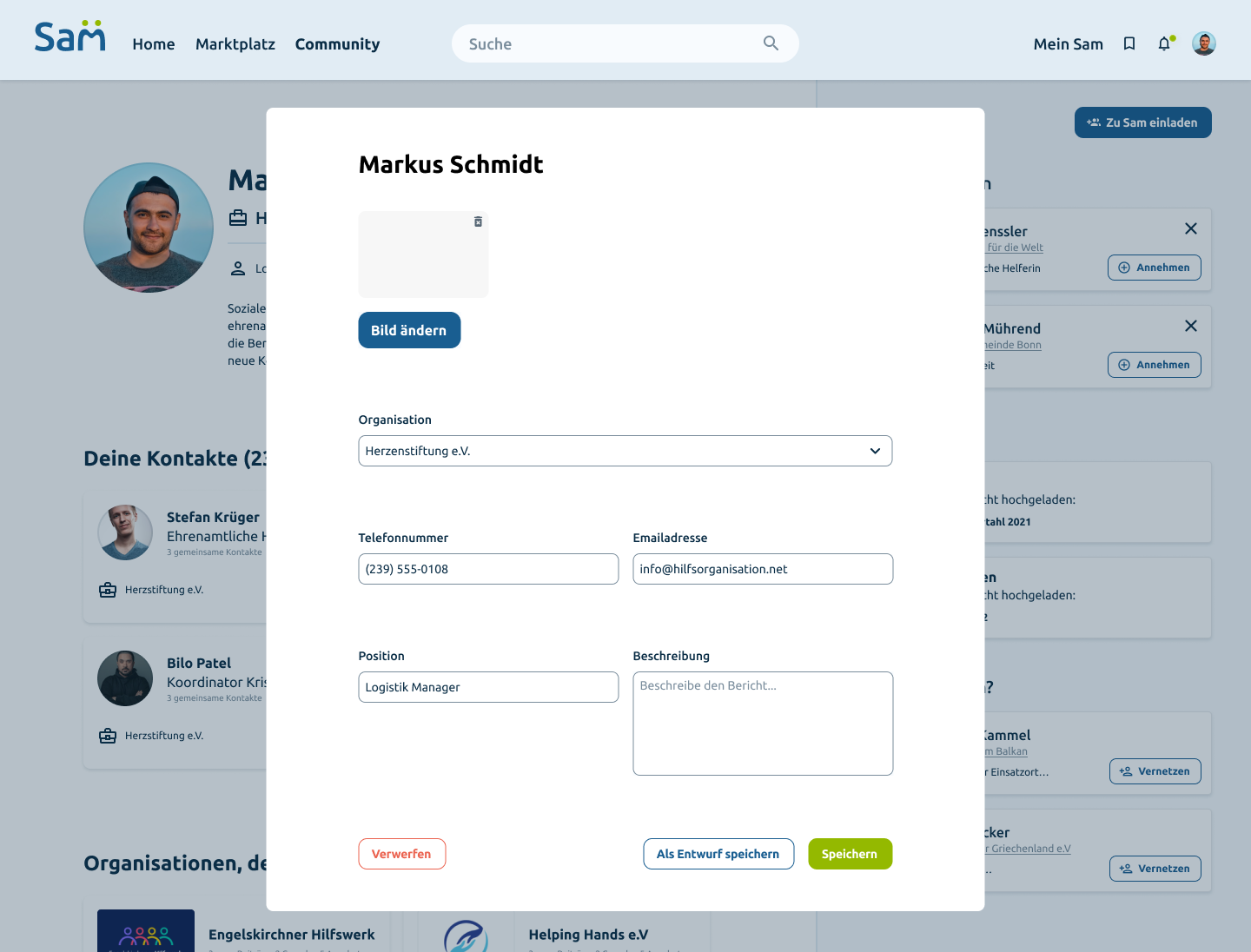
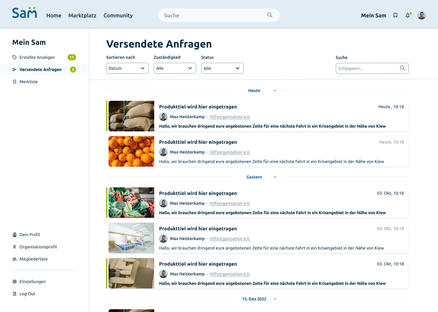
SAM is a digital platform that lets non-profits list items, handle incoming requests and chat with partners in one place. Organizations can merge multiple articles into packages and coordinate logistics across locations — making the exchange of relief supplies fast, transparent and organized.

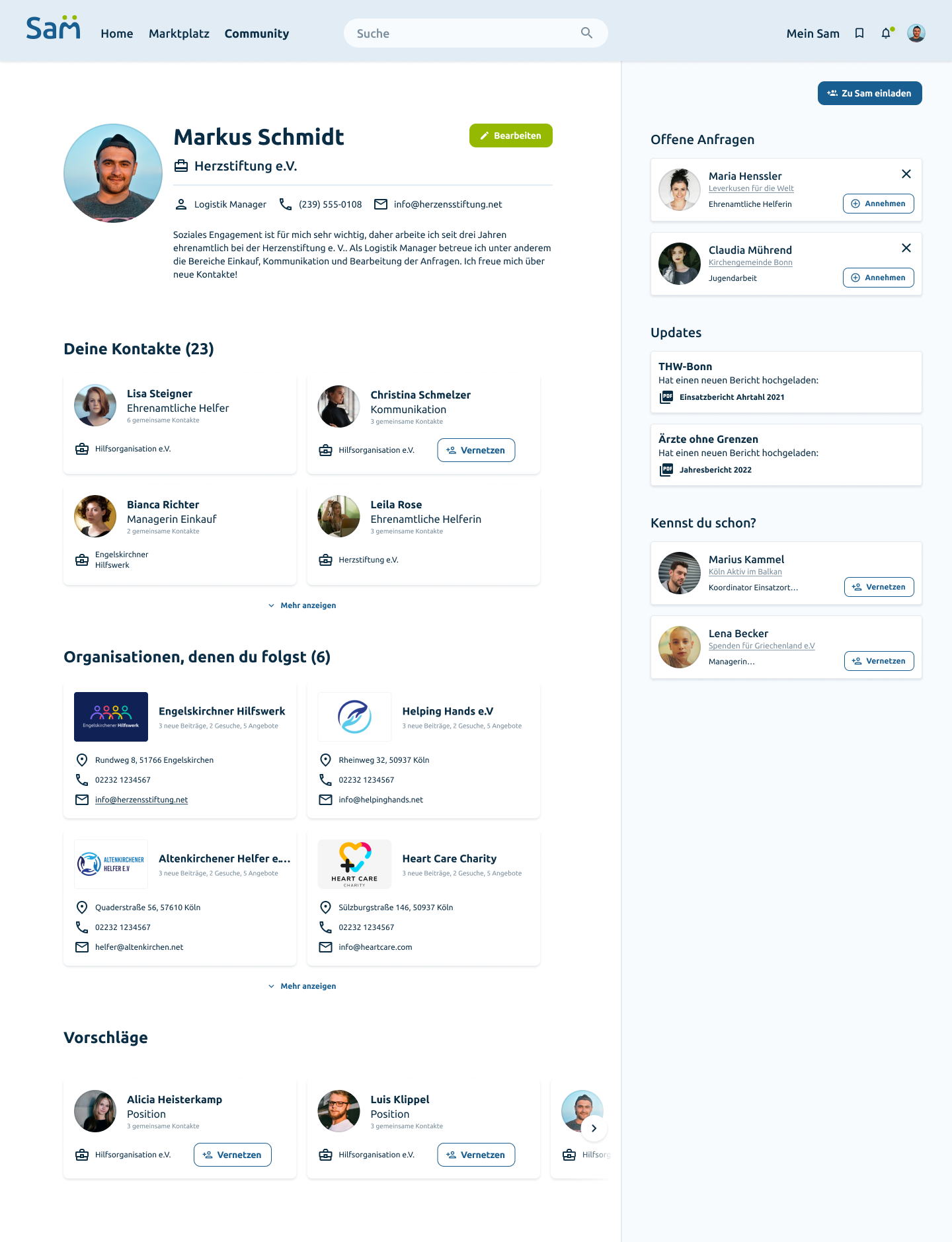
SAM Profile
SAM Marktplatz
SAM Chat
SAM Merkliste
Ideation

Based on the research insights, we defined how organizations would move through the platform — from first contact to a successful exchange — and translated this into a clear structure for the product.

User Flow

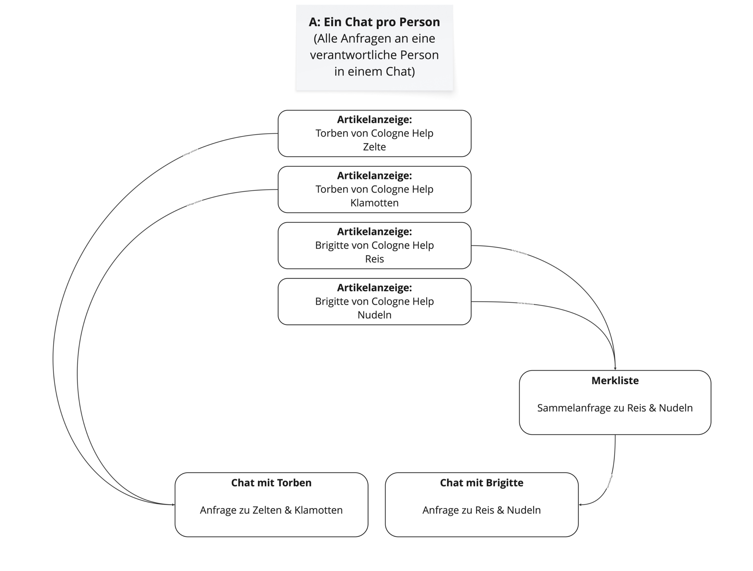
We mapped the core journeys of an aid organization through the platform — making sure every step has a clear purpose and no dead ends.
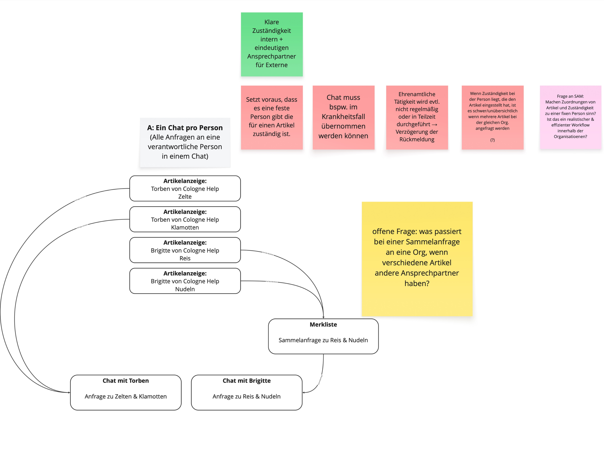
SAM user flow 1

User flow — 01

SAM user flow 2

User flow — 02

Swipe to explore →

Information Architecture

In a team workshop, we clustered all features into five core areas — dashboard, resource marketplace, infopoint, network and account. Features that didn't serve the core exchange were cut to keep the platform focused.
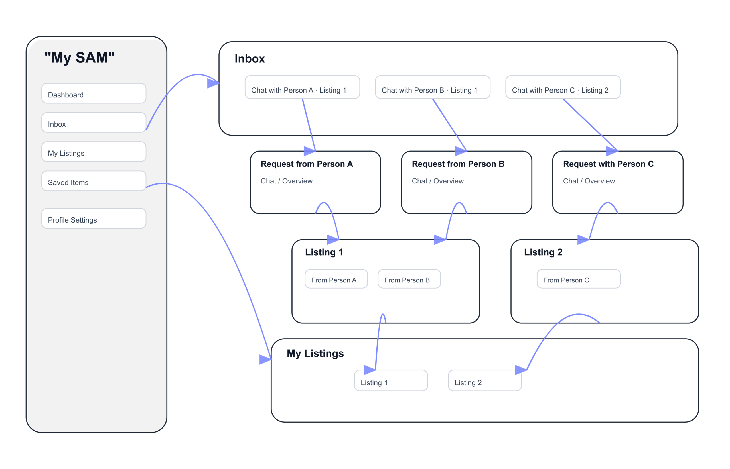
Team workshop — clustering platform features into five core areas

Swipe to explore →

Feature mapping — team workshop

Design

With the structure in place, we translated the five core areas into screens — starting with wireframes to test layout and hierarchy before moving to the final UI.

Wireframes

We designed mid-fidelity wireframes for the core screens — dashboard, marketplace, chat and account — focusing on clarity and a simple exchange flow. Scroll inside each screen to explore the full page.
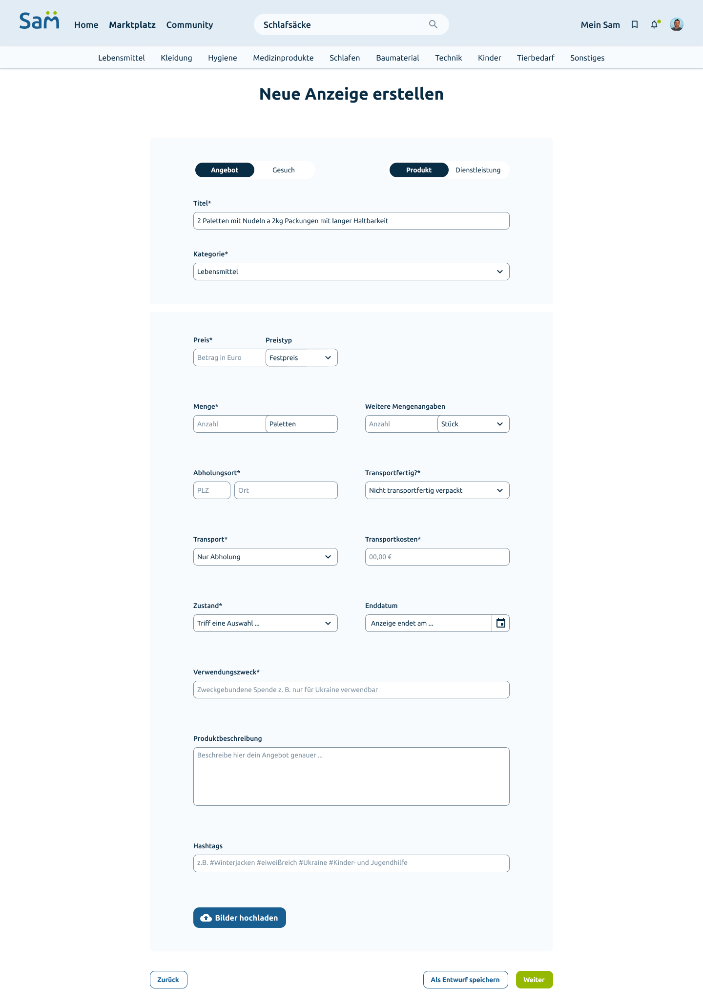
SAM Profile
SAM Marktplatz
SAM Chat
SAM Merkliste
SAM Wireframe 5
SAM Wireframe 6

Style Guide

To keep the design consistent across the team, we defined a shared style guide — colors, typography, spacing and UI components. The palette builds on calm, trustworthy tones that fit the non-profit context, while clear typography keeps complex content readable. Every team member designed against the same rules, so the platform feels like one product, not eleven different hands.
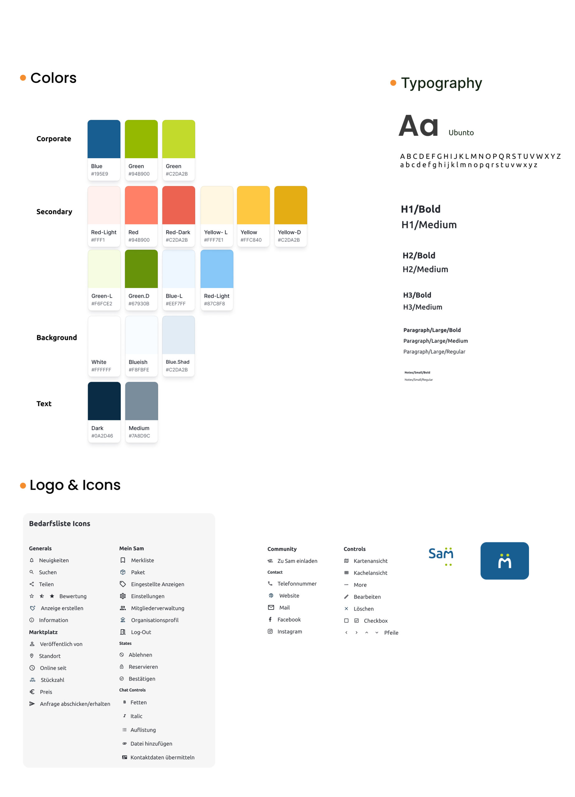
SAM style guide — colors, typography and UI components

Style guide — colors, typography & components
Prototype

We built a clickable prototype in Figma covering the core flows of the platform — browsing the marketplace, creating a request and getting in contact with another organization. Try it yourself below.

Testing

We tested the platform in multiple rounds of moderated usability tests, covering the dashboard, marketplace and community. Between rounds, we redesigned what didn't work — the revised marketplace listings were significantly better understood in the later tests than the first version.

01 — Dashboard

Wording caused doubt

The purpose of the platform was clear and the dashboard felt right — but labels like "your requests" vs. "your listings" confused users, and search requests were overlooked entirely.

→ We sharpened the wording and moved content like news into the community area, where users expected it.

02 — Marketplace

Filters yes — but clearer

Filters were welcomed, but details raised questions: distance from where? How many items per pallet? Users also missed the price on listing cards — and the "verified" badge proved crucial for trust between organizations.

→ We redesigned the listings between test rounds — the new version was understood far better — and made the request button more prominent.

03 — Community

Less noise, more identity

The first impression was "too much, too cluttered" — while organization profiles lacked exactly what builds trust: website, contact person, focus and locations. Official reports were valued as proof of legitimacy.

→ We decluttered the start page and extended profiles with the missing trust signals.

"Every single tester wanted SAM to become real — many said they would use it several times a week."

Overall result — a clear gap in the market

The Result

SAM is live — a real platform for a real client. As part of the project, we also produced a promotional video presenting SAM to potential partner organizations. Watch it below, then explore the platform yourself.

Visit hello-sam.eu

Live platform — real client project